Crestline 2017

February 16th, 2017

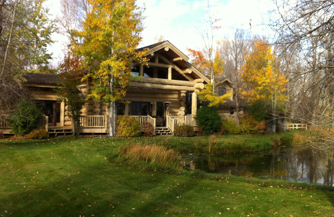
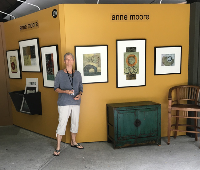
Thanks to our friends Bruce and Sandy Wegner we had use of their cabin in the mountains again this year. Since Anne was just juried into the Laguna Festival of Arts again, she had plenty of reason to produce lots of good art.
(Double click on photos for larger views.)

Anne-Wide-Array

Crestline-Cabin-115

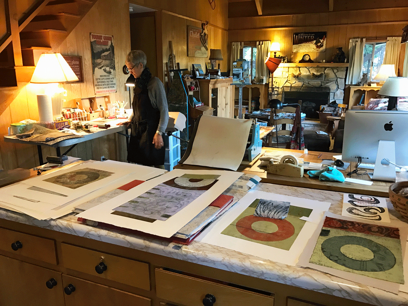
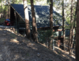
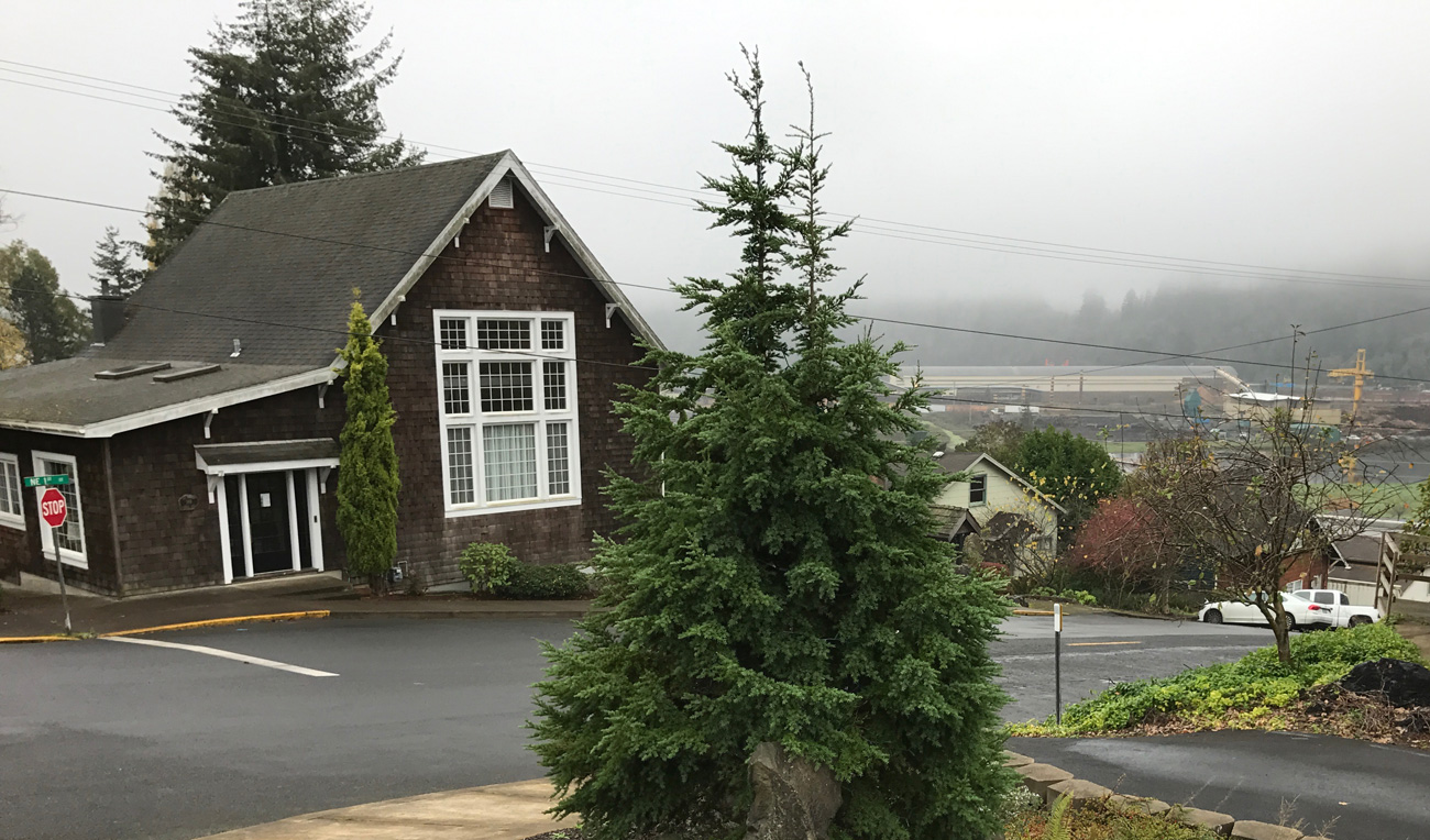
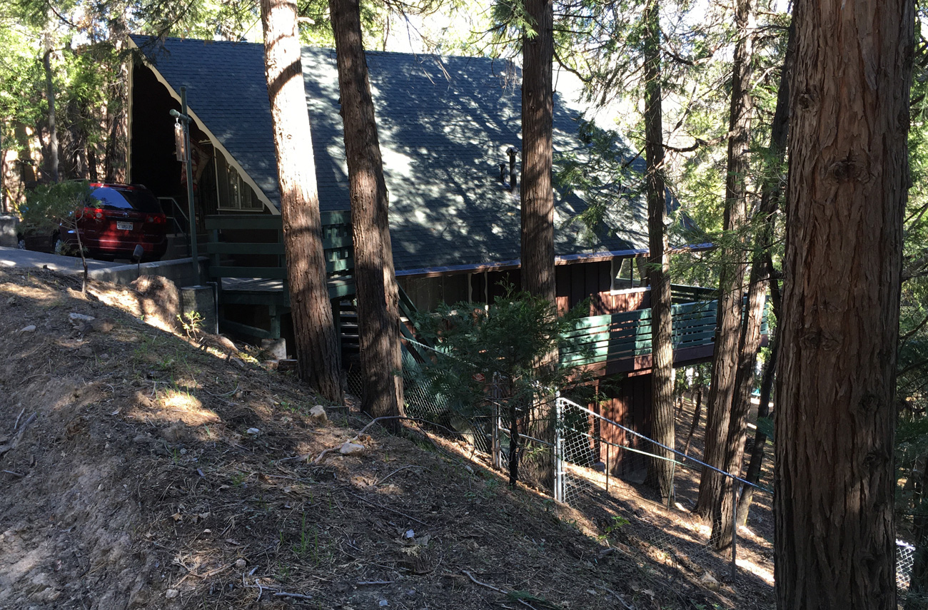
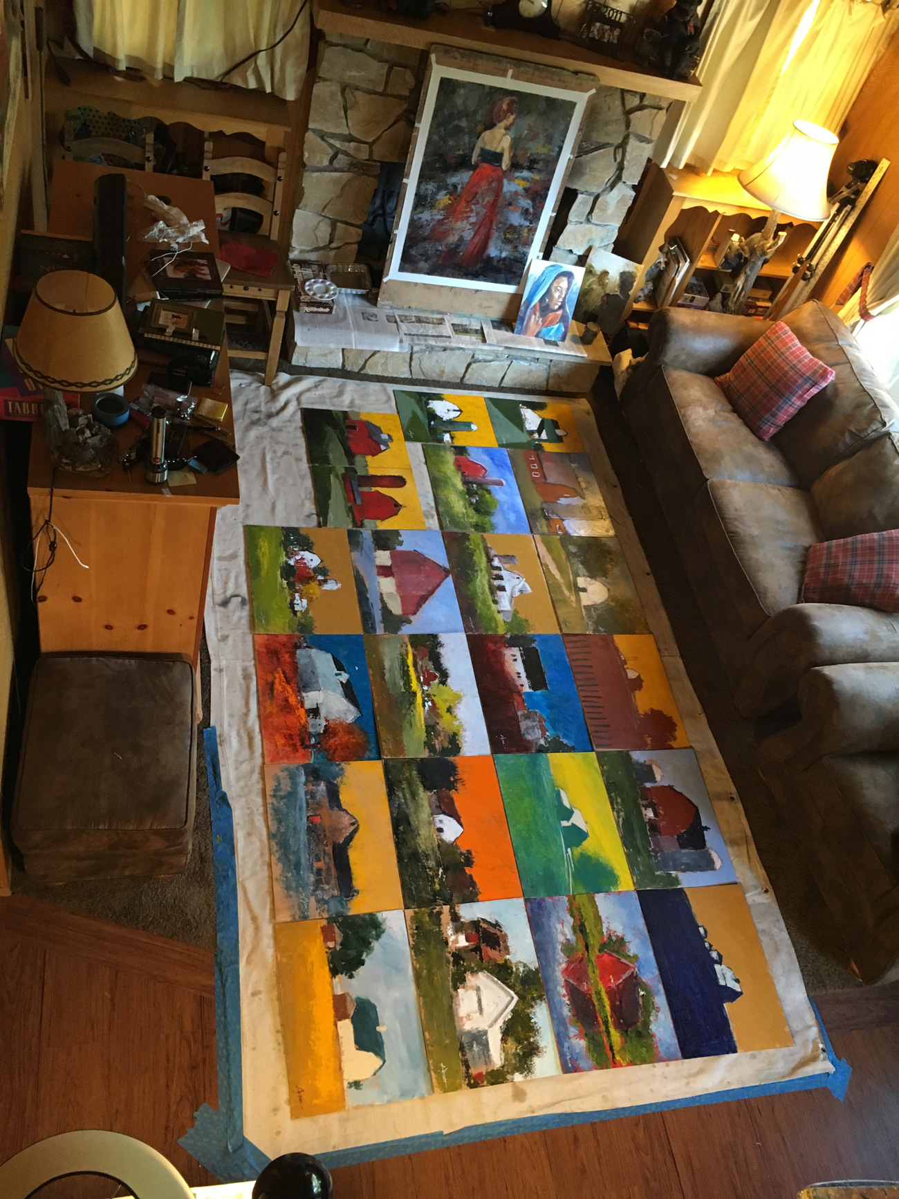
That’s the cabin on the left. Sorry its such a small shot. You can see it larger, and our blog on last year’s time here. Above is how the place looked after we turned it into a studio and had been at it a couple of days. That’s her press on the table (under its blanket) next to the computer, where I spent a lot of time.

Spread-on-bed

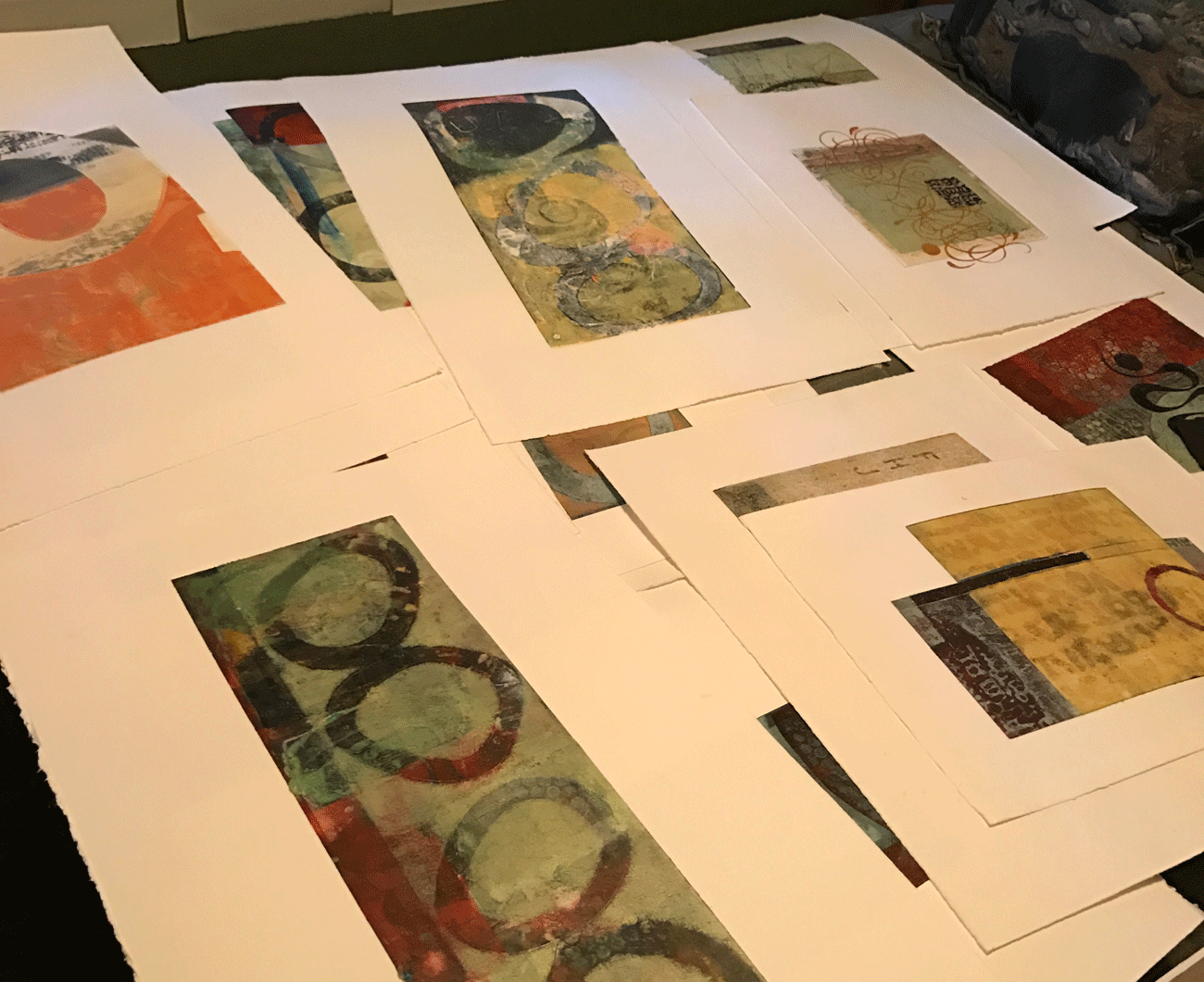
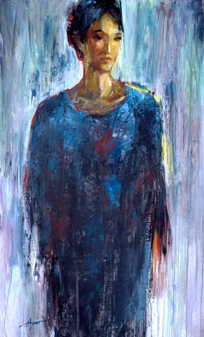
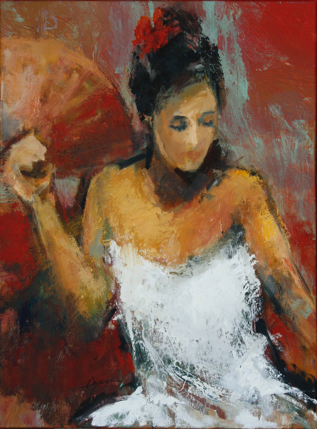
Anne brought a lot of unfinished pieces, awaiting further inspiration and more time to work on them. In these almost two weeks she worked on 40 pieces!
One of the challenges is where to put them all as they’re drying. All the walls were used as well as this guest bed.

Anne-w-red

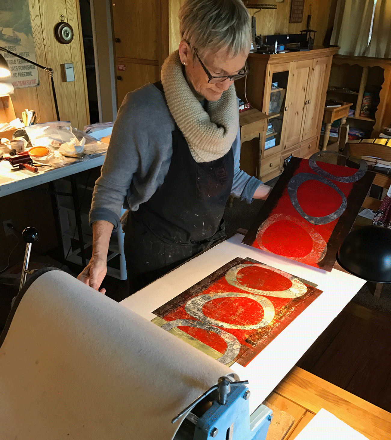
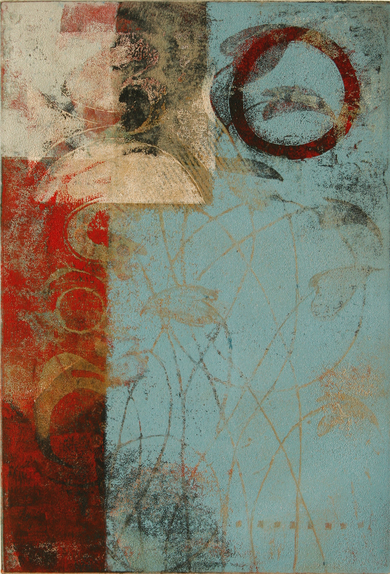
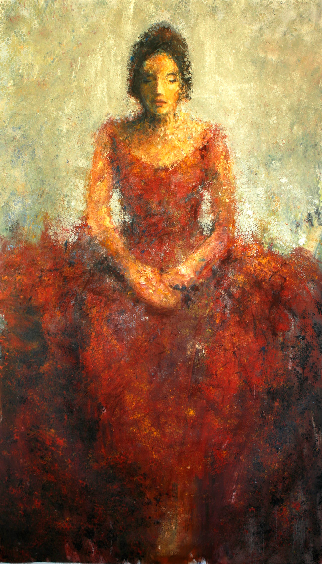
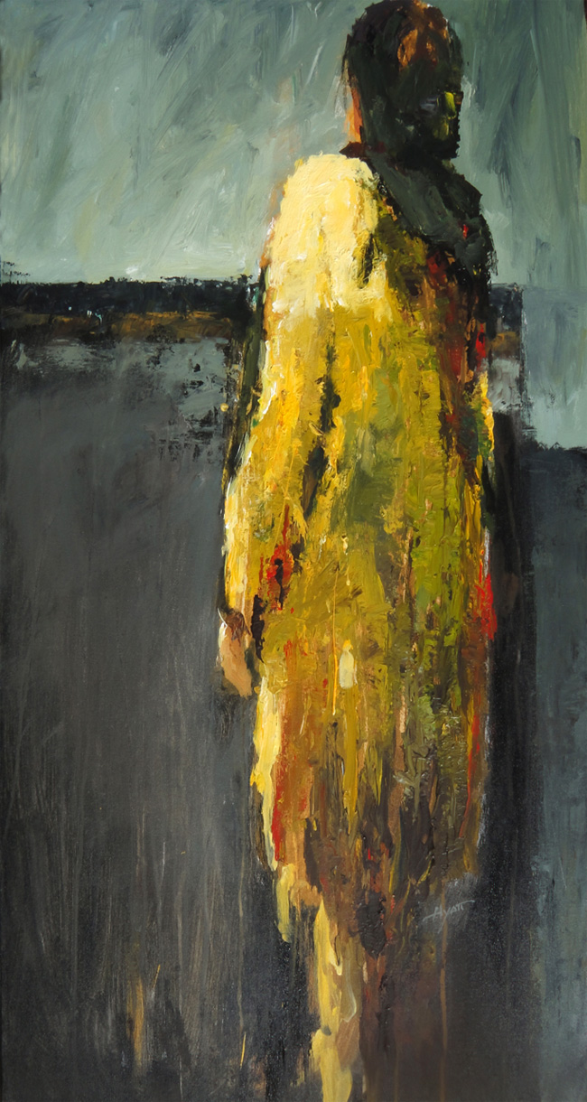
Monotype printmaking, the way Anne does it, involves a number of layers. It’s part intelligent design and part discovery of what will happen. Here she’s just lifted the plate off the paper after running them through the press. Note where part of the red ink was masked off by those ovals, also of her making.

Red-Before-and-After

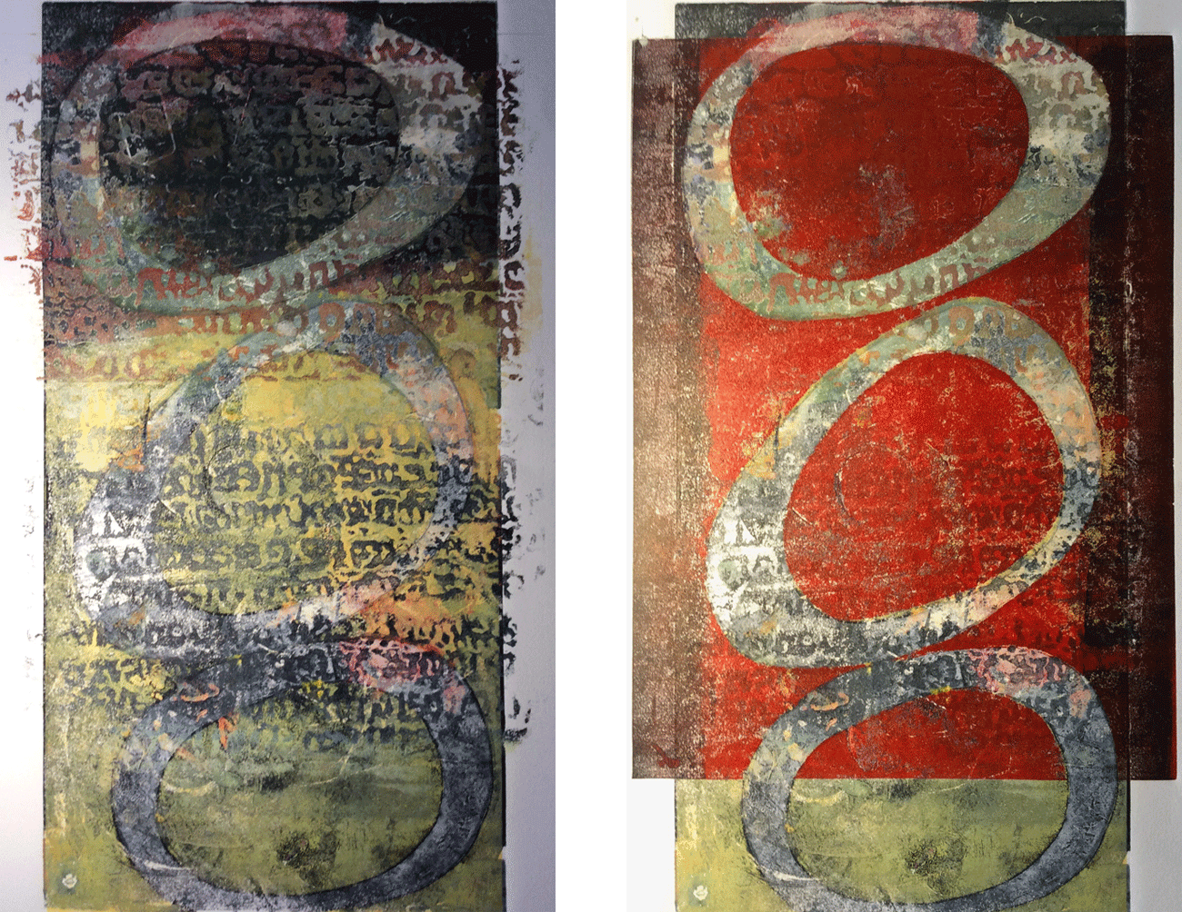
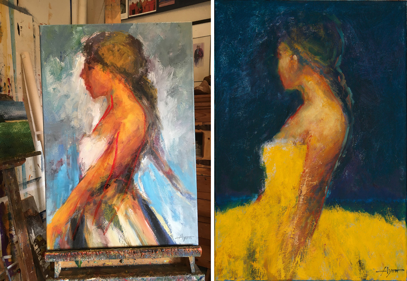
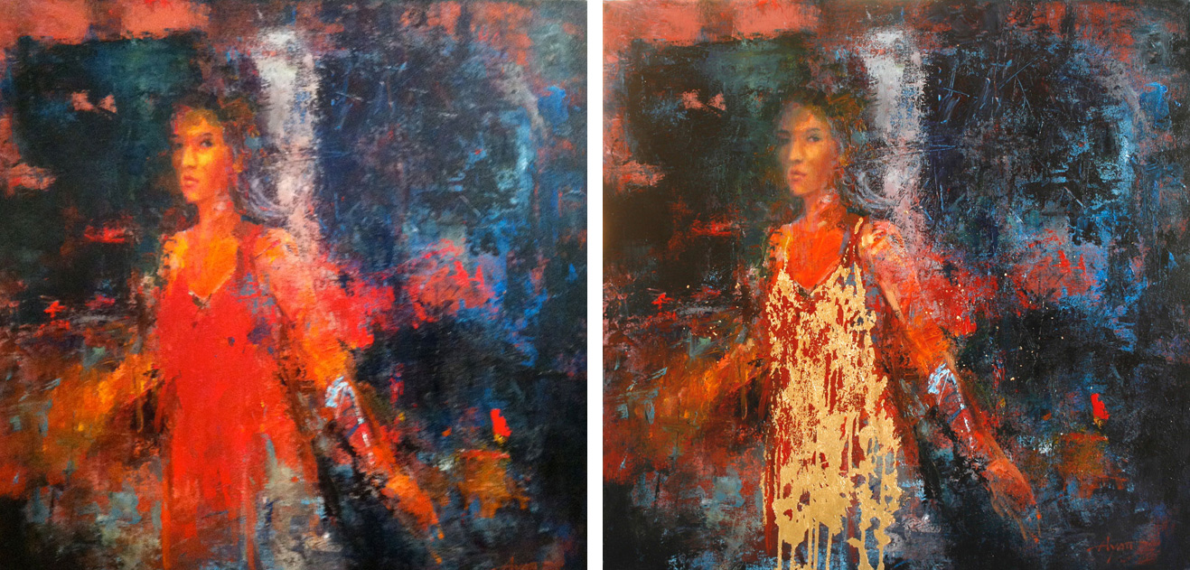
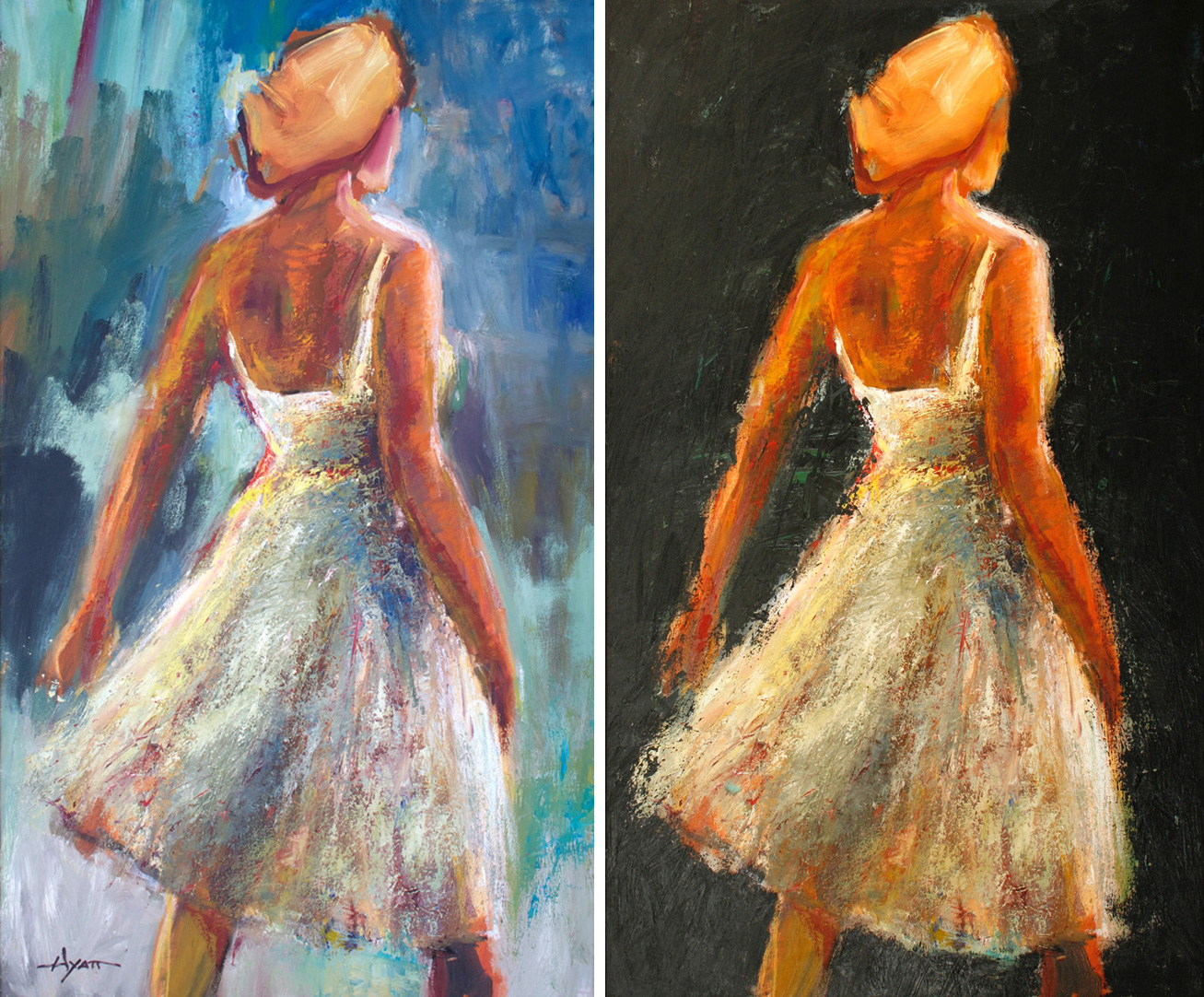
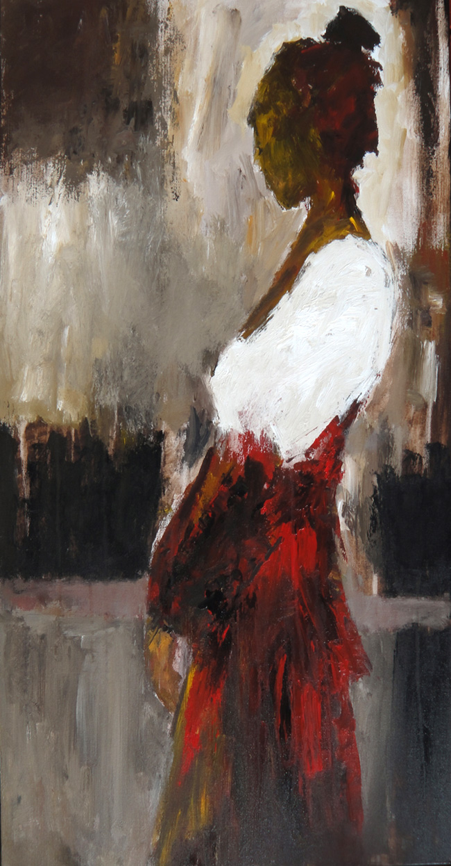
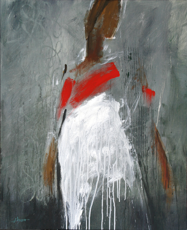
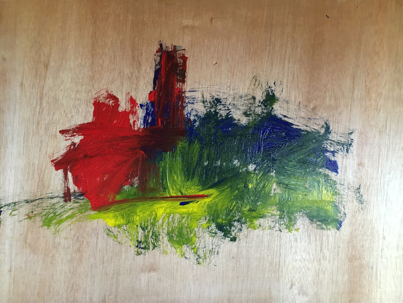
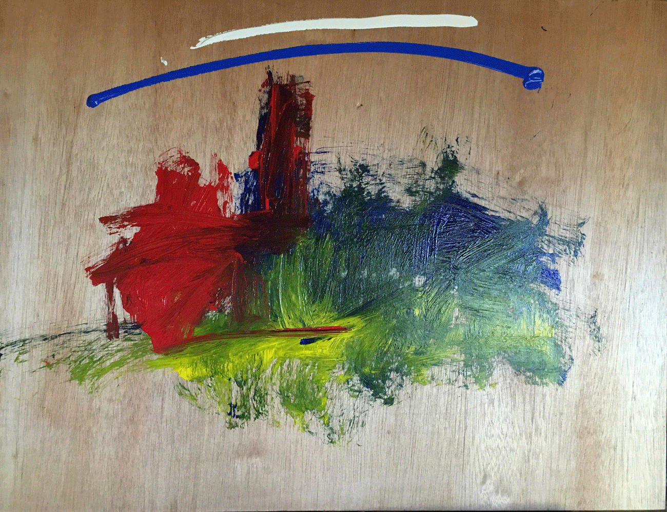
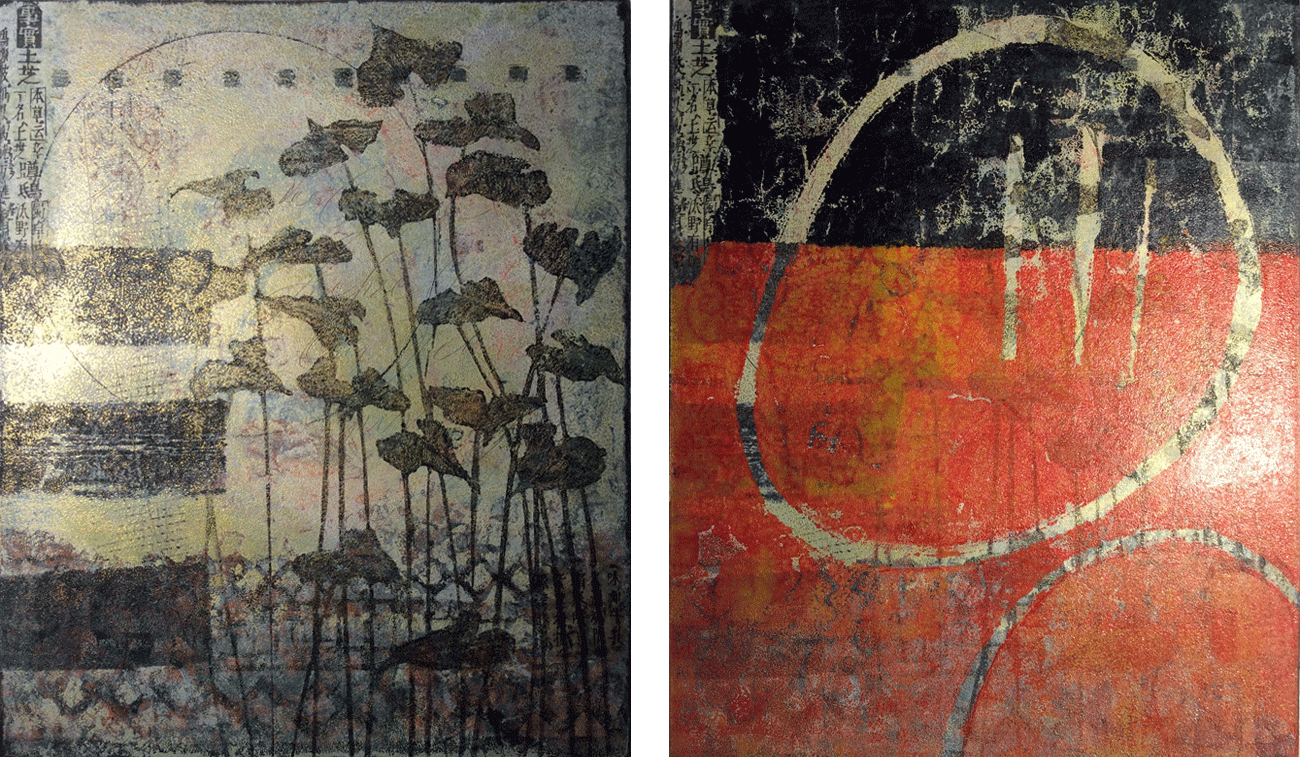
To give an idea how these things can change with every new layer, the above shows the finished product (right) with how the piece looked just before that. Even that one (left) had multiple layers to get to that point.

Round-bef-and-after

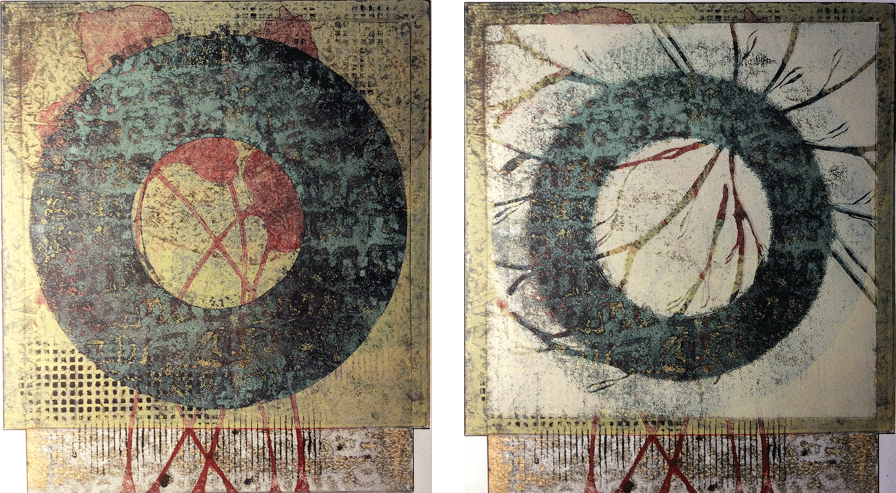
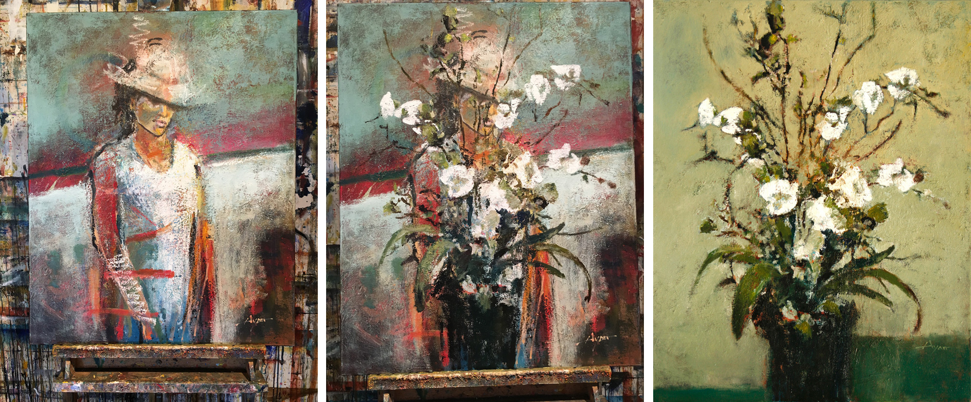
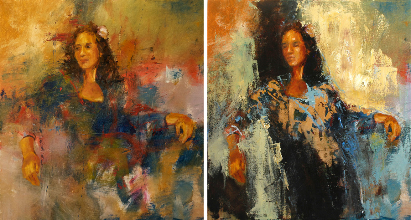
Here’s another “before and after.” You can see why it’s sometimes hard to know when a piece is finished. I’m always looking at her unfinished work and calling it beautiful. But she’s not satisfied till she’s satisfied.

Flowers-bef-and-aft

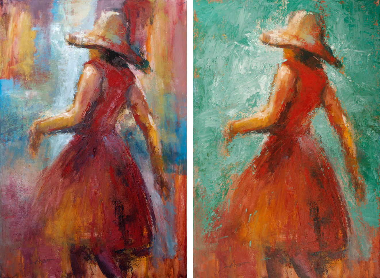
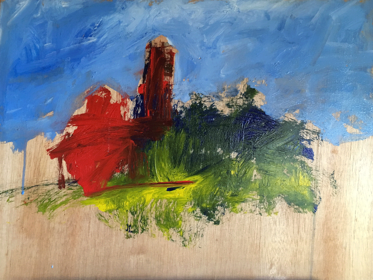
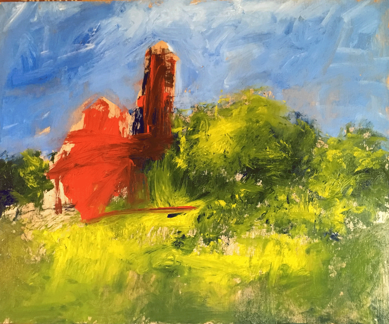
Talk about transformation, here’s another. You can hardly tell the one on the left led to the one on the right. But the first is forever gone, serving now only as underlying intrigue for the finished work.
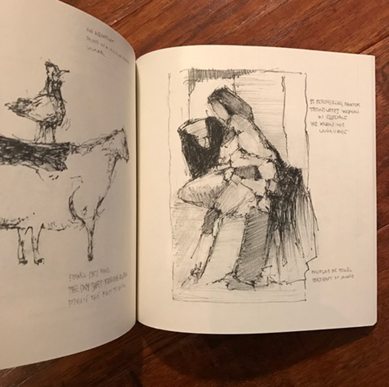
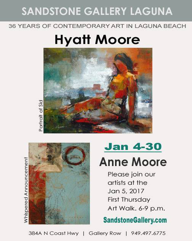
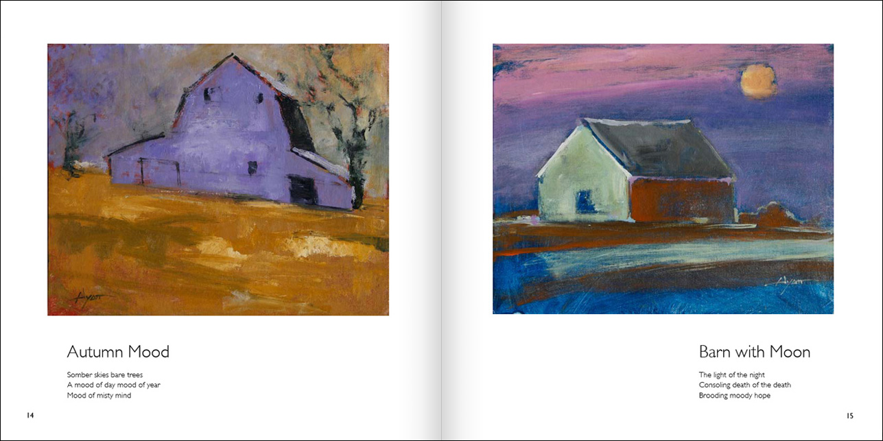
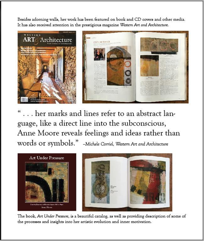
For her book showing many more examples of finished work and how it’s made, click on Art Under Pressure at right.

Hyatt-brushes

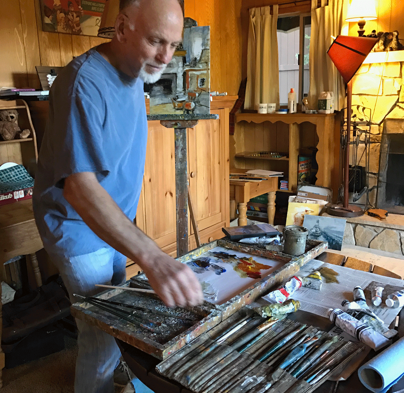
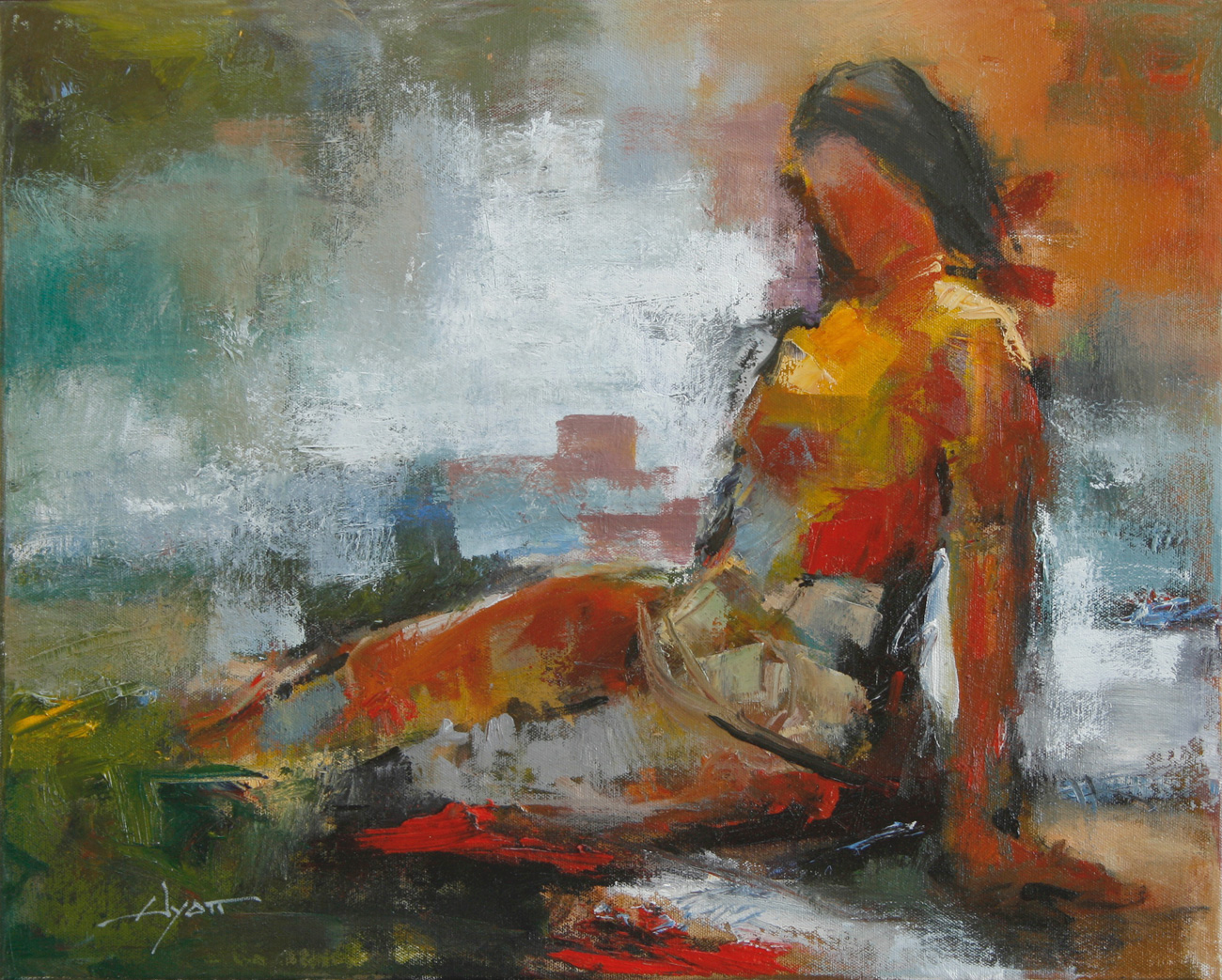
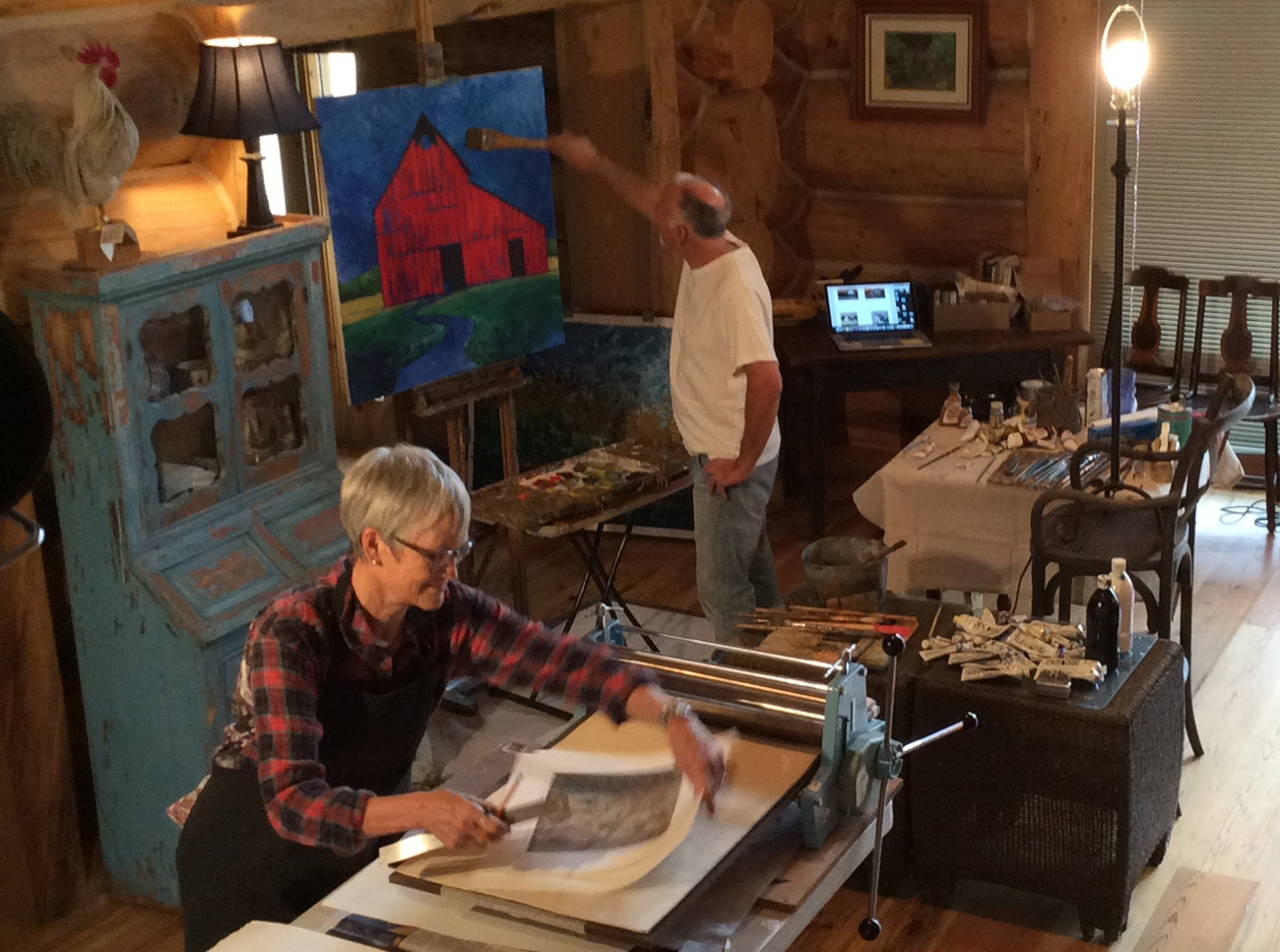
While Anne was super productive in both quantity and quality, I painted very little this trip. Here I am getting started on a little piece I didn’t keep. I spent the majority of my time writing, another of my interests/artforms. So at least I wasn’t frustrated when the painting wasn’t going so well.

Three-paintings

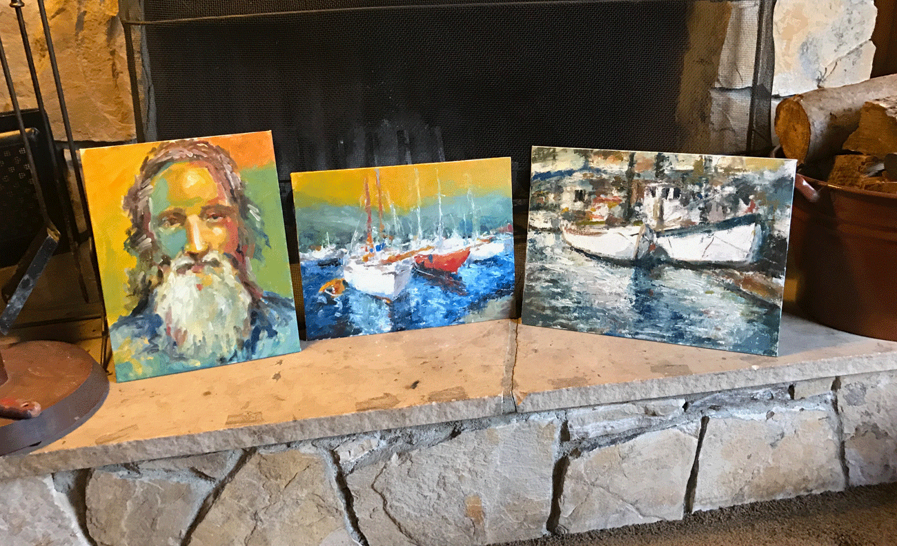
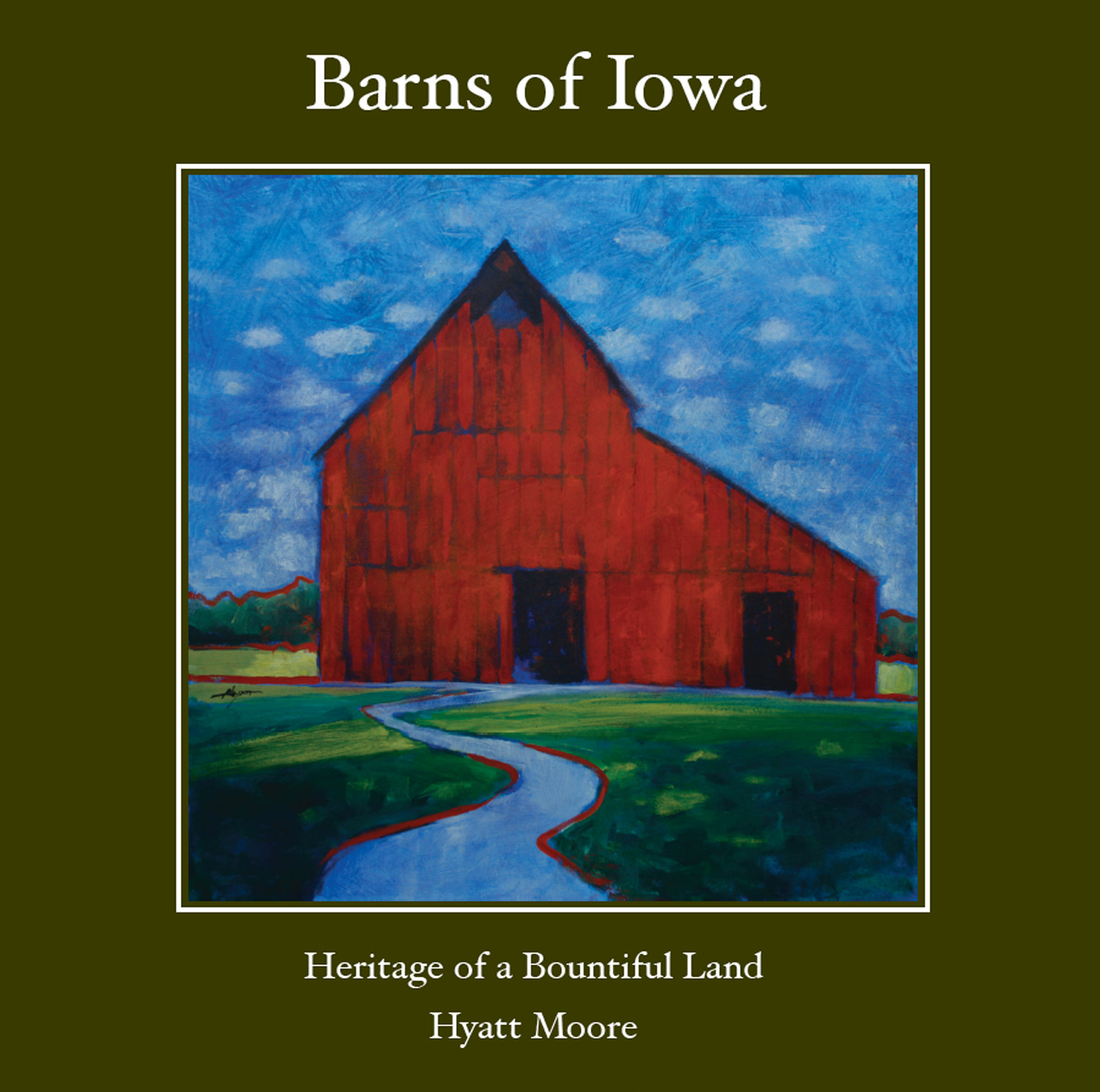
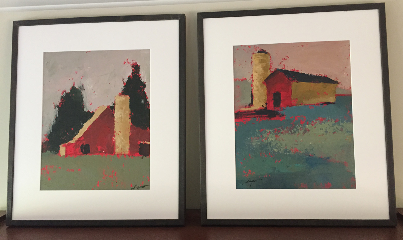
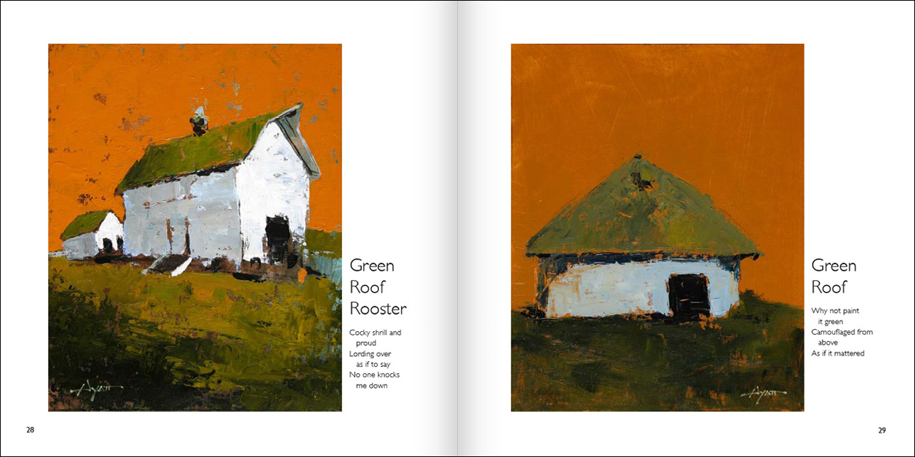
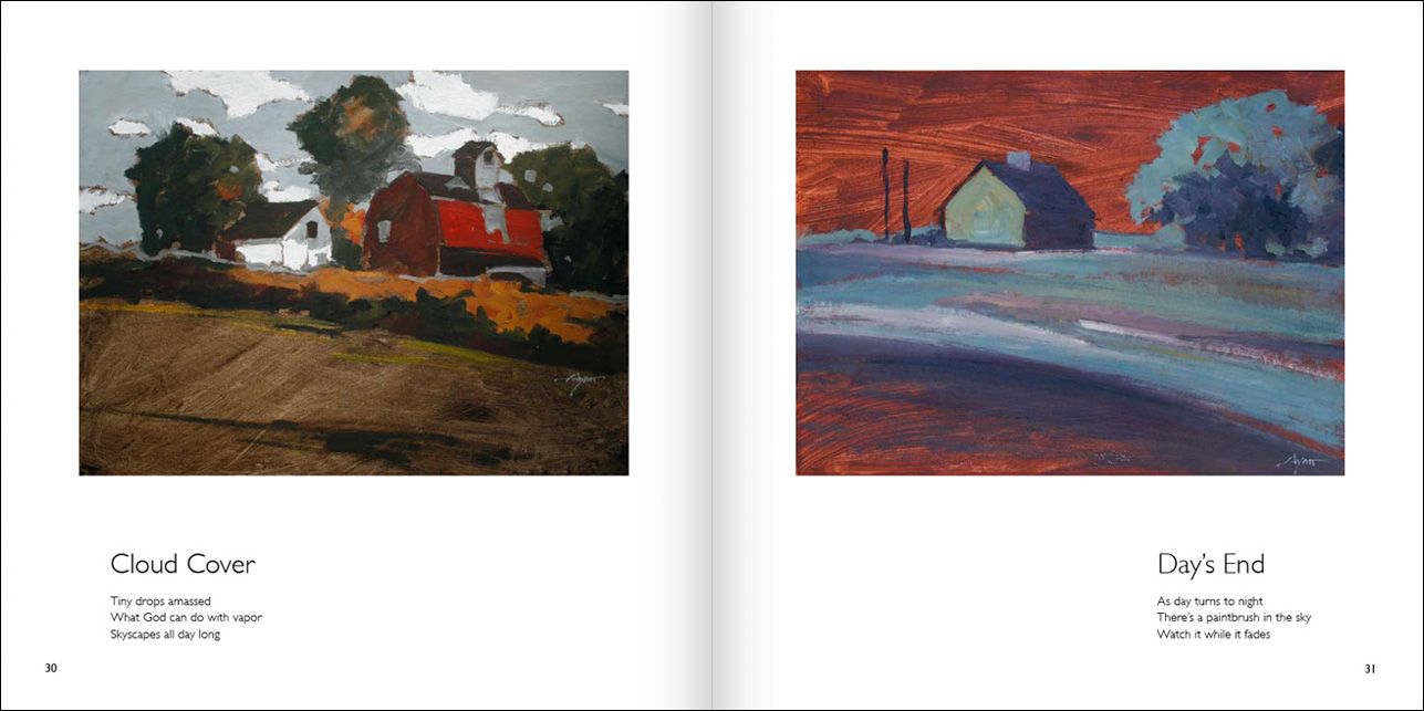
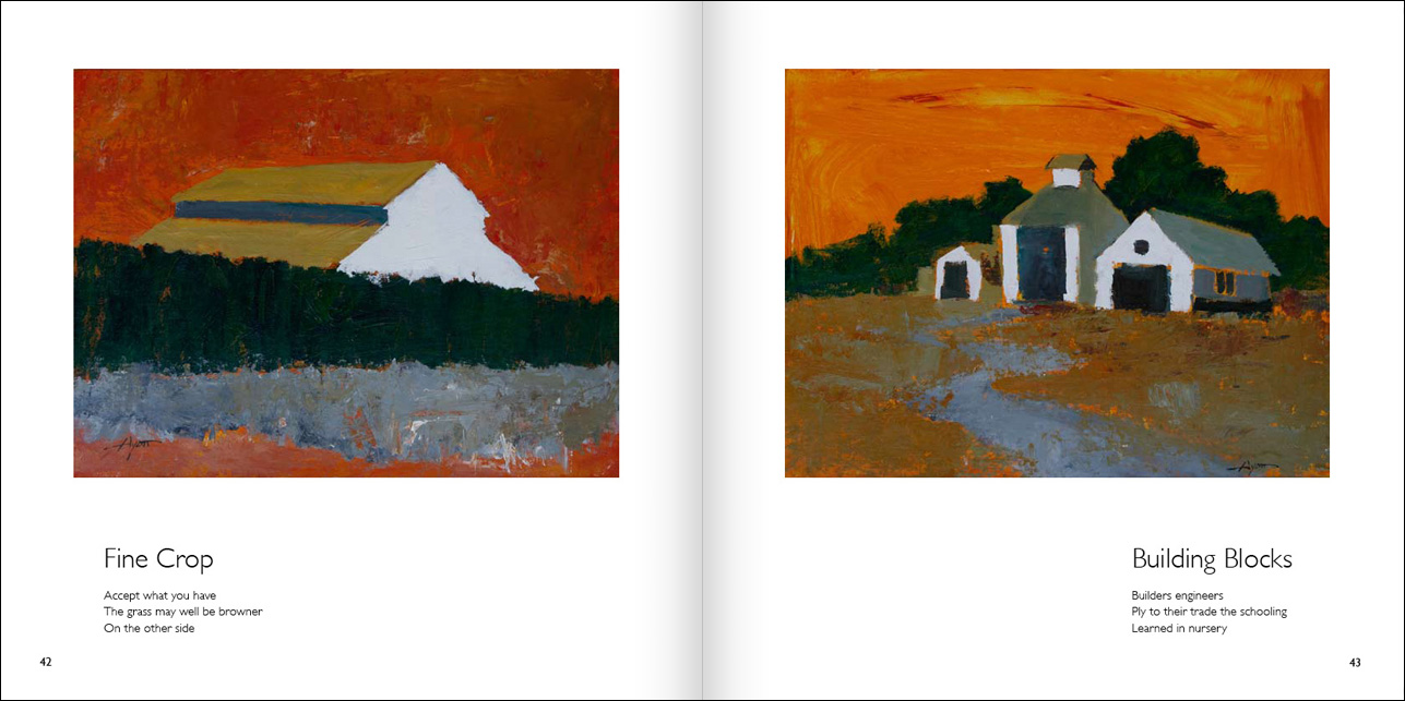
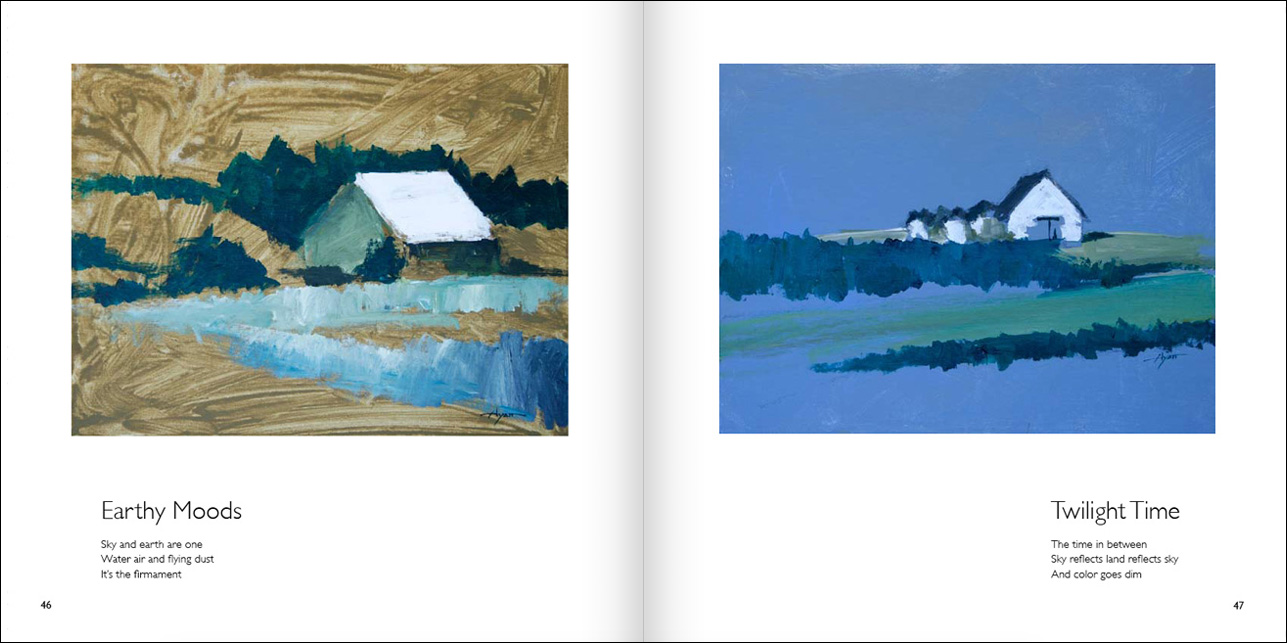
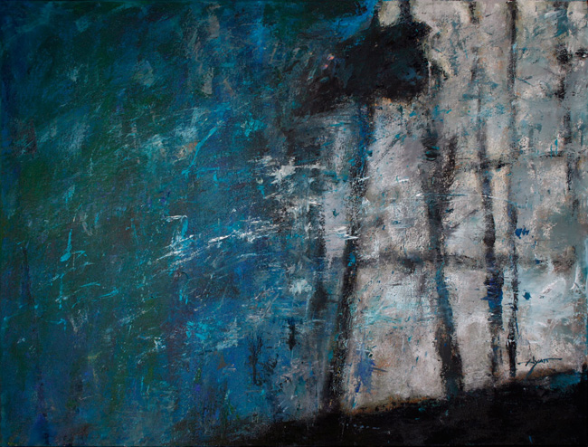
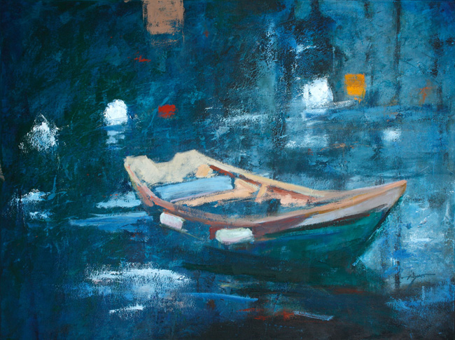
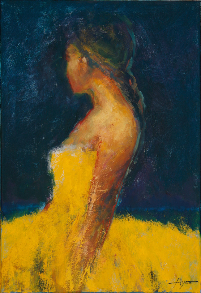
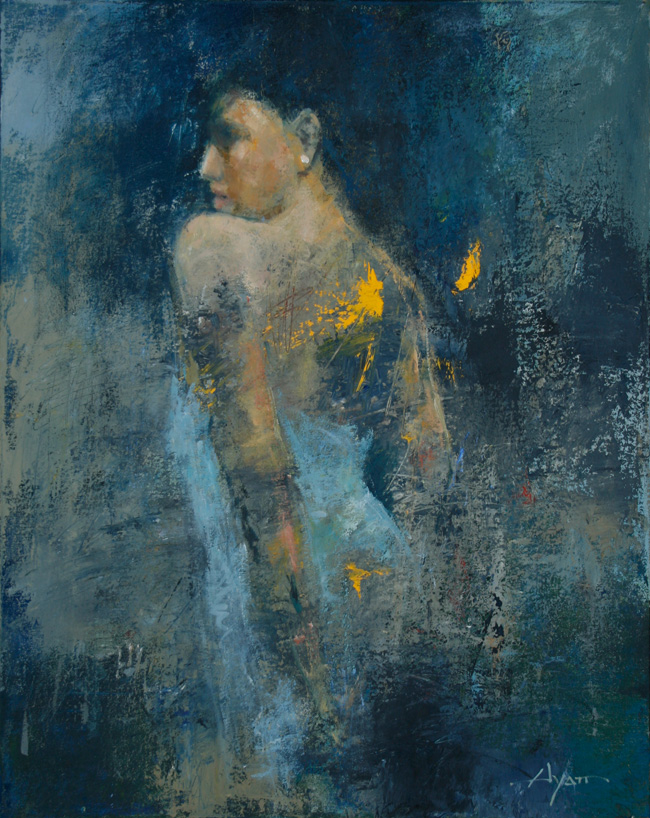
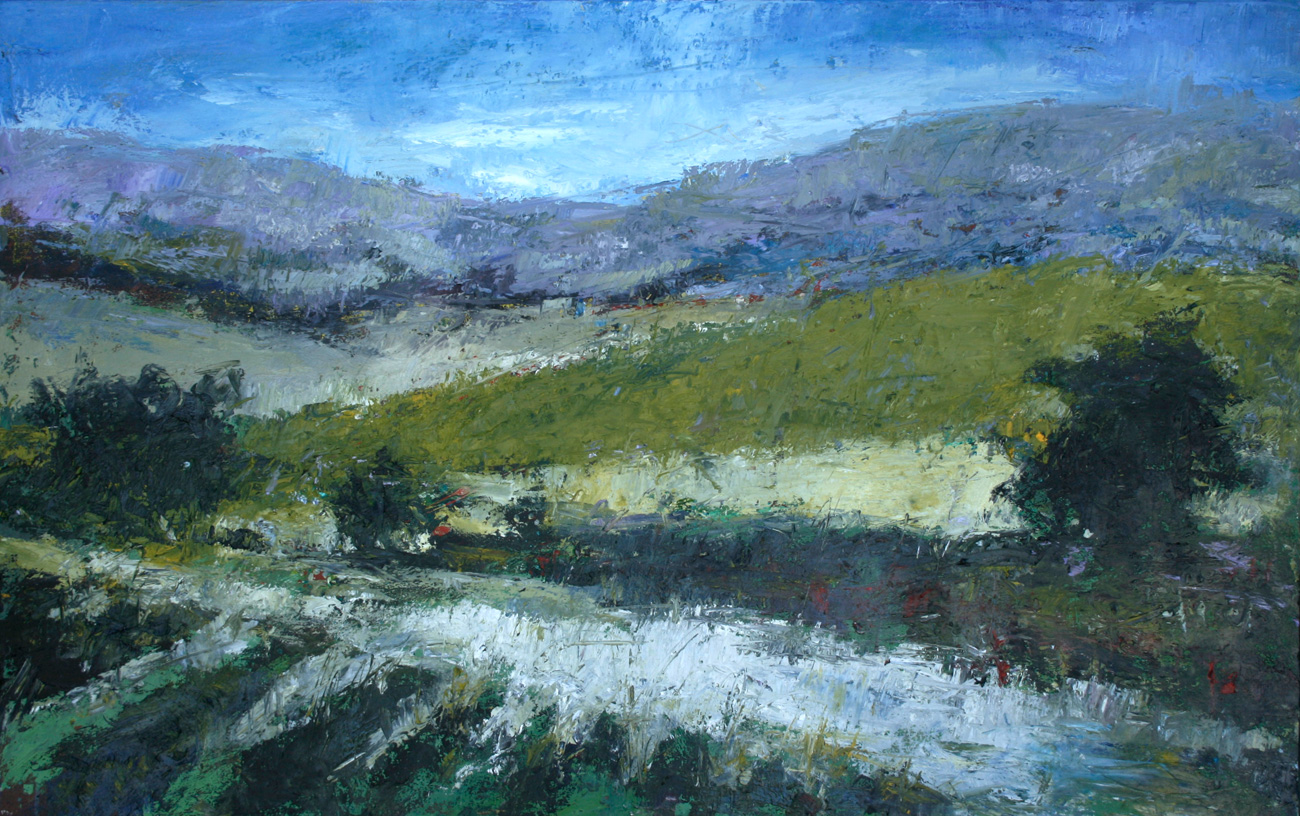
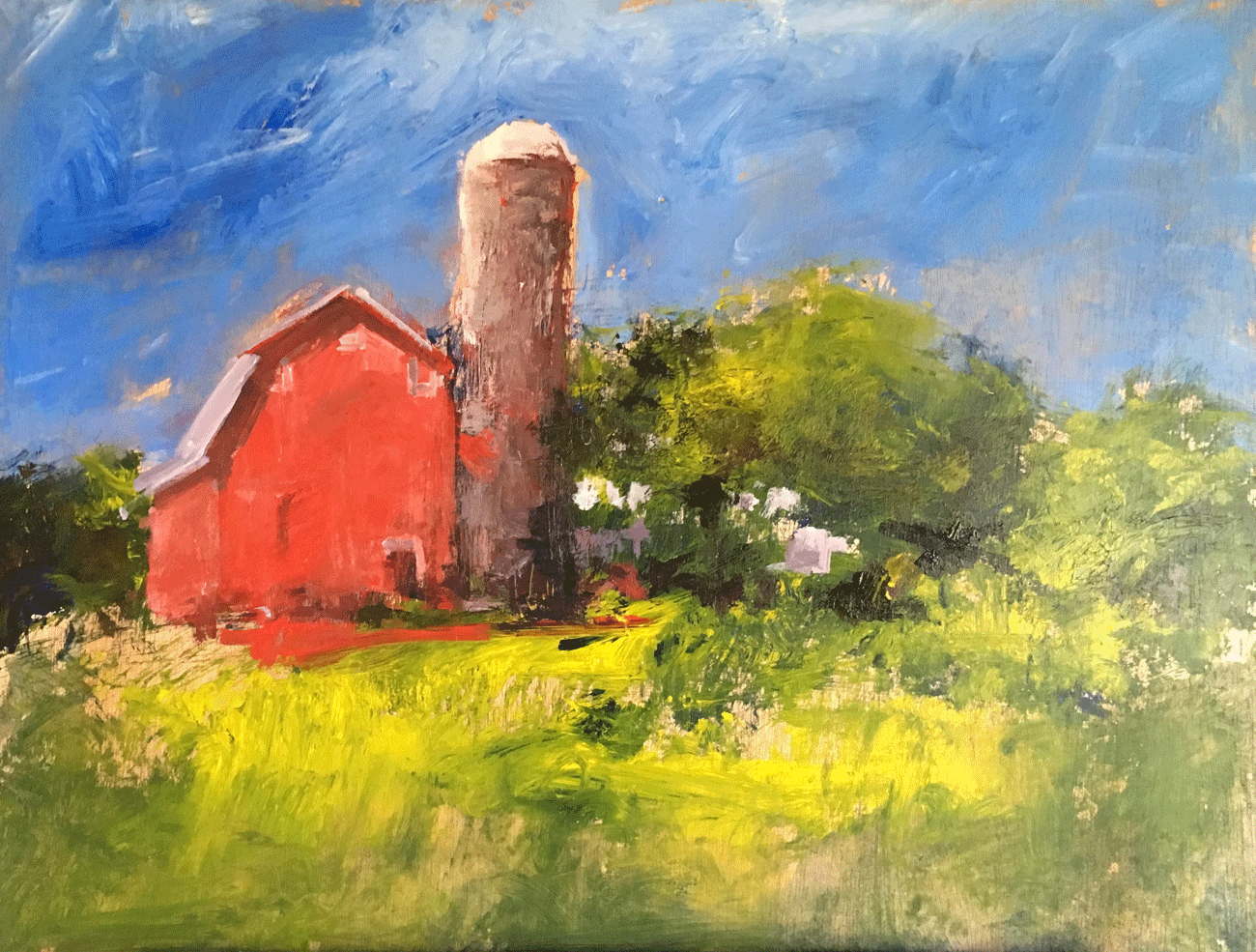
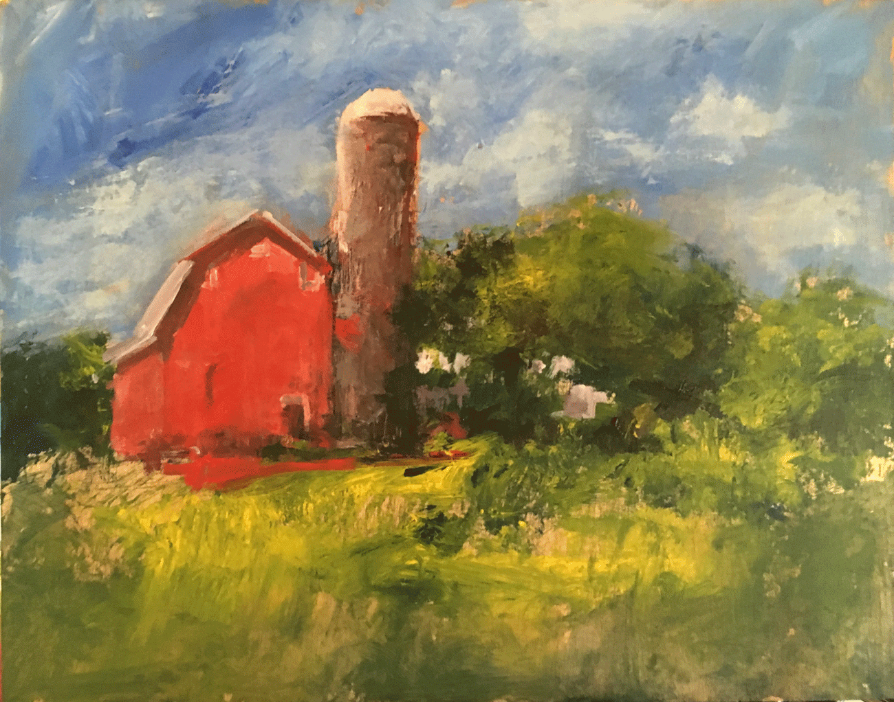
I was trying a new style which I thought would be easy, but wasn’t. Here are three small works I kept . . . nothing like the numerous big ones and a score or so of barn paintings done last year. (See the book created from those at right.)

Fire

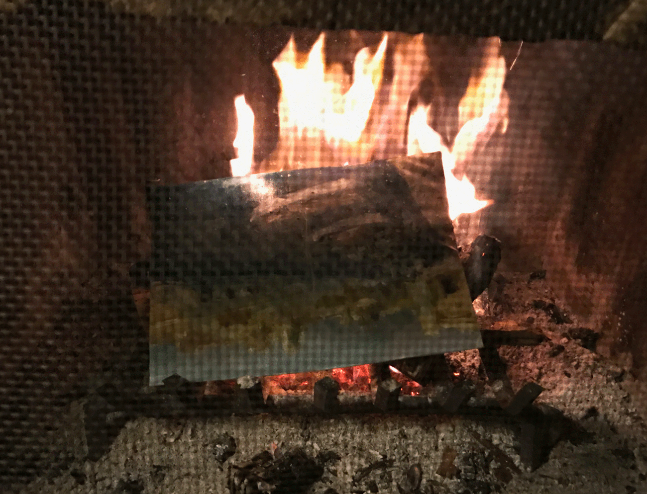
Did I say I was less than pleased with some of my work? Here’s how four of them ended up, in the flames. I will say our fireside times every evening, with a book or a movie, were part of the delight of everything.

Anne-and-me

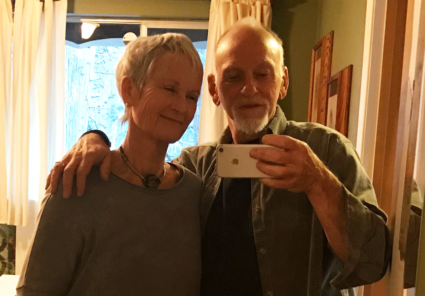
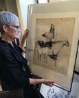
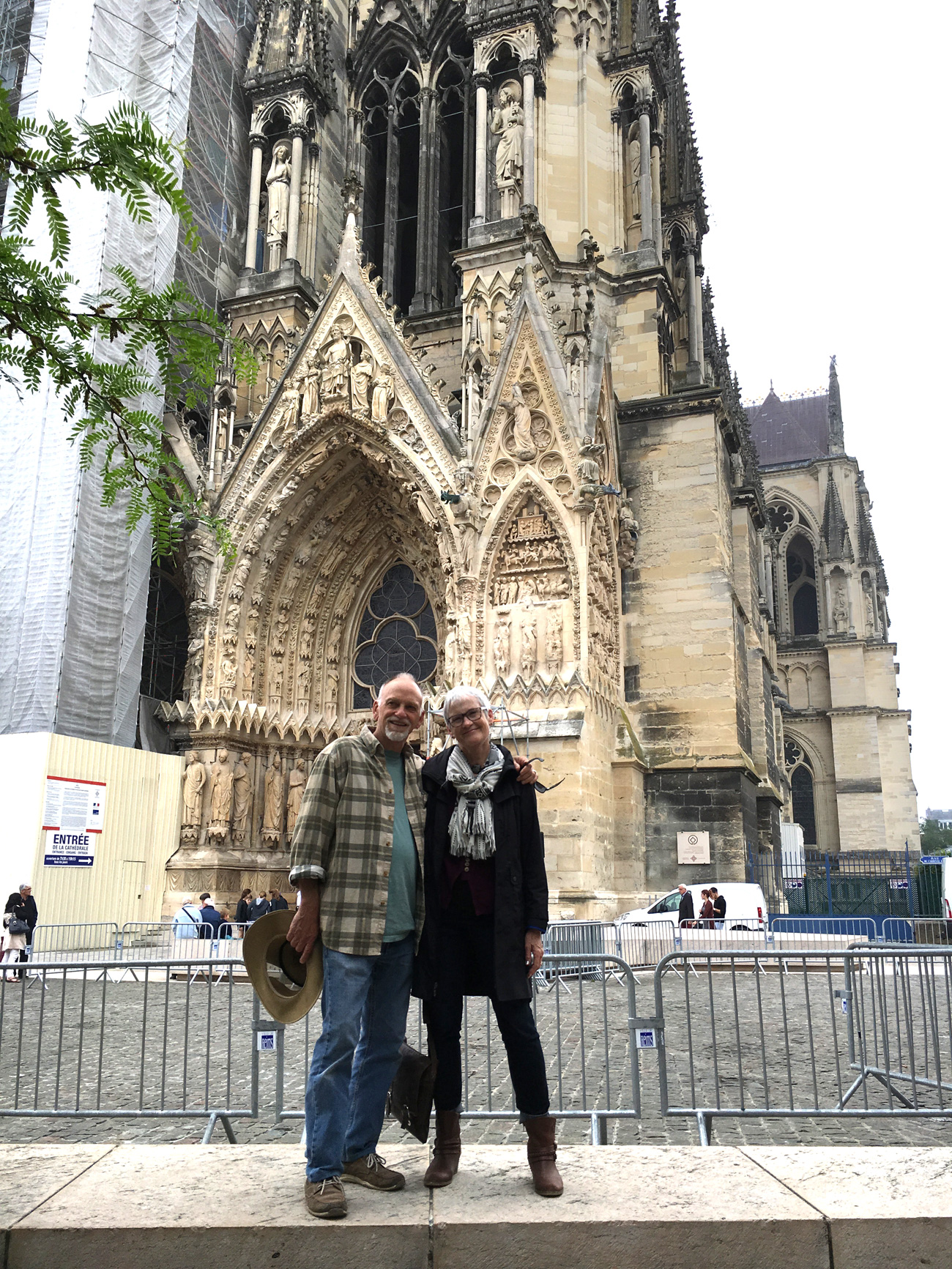
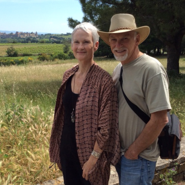
And finally, a selfie in a mirror on our last day, celebrating our 51st anniversary (tomorrow). With five children and 16 grandchildren, most scattered around the country, we’re rich. And grateful for all things.

8 Comments

Sandstone Show features Hyatt and Anne

January 3rd, 2017

For some years Anne and I have been part of Sandstone Gallery in Laguna Beach. Each month two of the nine participating artists are featured. This is the first time for both of us to be featured at the same time. It’s always a fun evening, with all the galleries open and lots of people out. You’d enjoy it.

portrait-of-sid-1300

sid-115
Sid in a pose just right for a painting.

Here’s a quick look at the painting used in the advertising. When Anne and I were in France last spring we took in many, many art museums. We were inspired by everything. Now and then I’d come across a piece that enthused me to try one similar. The above, Portrait of Sid (16″x20″) is my result of that. In many ways it’s not so different from approaches I already use, but perhaps taken a little further. That’s Sid herself in the black and white photo I came across from 1967, about the time we all went different ways.anne-w-anne

Here’s a portrait of Anne photographing a detail of Portrait of Anne.

It was in Colmar, France, where we came across the painting entitled Portrait of Anne, by Russian painter Nicolas de Stael, done in 1953. I don’t know if Anne was taking this picture because she loved the painting as I did, or its name. (I’ve always loved that name.)

sketchbook-1300

anne-w-cow-115
Fowl cry foul
The sky she’s falling again
Bovine first to know.

Both of us were taking pictures all the time, her with i-pad, me with i-phone. But I also did a great deal of sketching. The book I produced after the trip is available and featured here. As you can see, though the painting is strong in its use of color, it also holds up in monotone with bold graphic elements. Since I was also writing haiku for the book, here’s the one that accompanied this page:

Saint Petersburg painter
Translates woman in essence
We know his language. 

The sketch on the facing page is after an aquatint print we found in the gift shop, a process particularly of interest to printmaker Anne. There’s my haiku for that one, too.

whispered-announcement-1300

Whispered Announcement, monotype, 15×10.

Here’s just one of the numerous original prints Anne is showing this month at Sandstone. As with so many of them, it was a long time in the making . . . begun in the home studio and completed much later during our artmaking hiatus in Oregon two months ago in November.

Here’s the announcement for the show, complete with times and address. Hope to see you, then or sometime.

sandstonefb-ad-650

Comments Off on Sandstone Show features Hyatt and Anne

New Book: Barns of Iowa

December 2nd, 2016

Here’s a book full of fun renditions of beautiful barns in their colorful and imaginative environments. And here’s an overview of its making.

cover-barns

It’s another of my 8-inch square series, in full color. The original of the cover painting hangs prominently in the inn’s lobby.
For all these photos, click to enlarge.

It’s been about two years since the project started. That’s when I was approached with making a couple of paintings for the University Park Inn and Suites in Ames, Iowa. They were redecorating their whole operation, new furniture, new fabrics, new colors, everything, all under the guidance of a professional hotel interior designer. From my two or three paintings they would produce prints to hang in each room. But I countered with a better idea. I would make original paintings for each room.

framed-art-1300

Matted and framed. When there was to be two in a room, I made a matching set.

Of course, the expense of that was a factor, but I proposed quickly done pieces with a minimum of direction coming from them. They would just supply photos, I would make renditions, and they would accept whatever I sent. They agreed and we were off.

toledo-studio

toledo-studio-w-michael

(Top) A view of Toledo, Oregon and (bottom), two painters enjoying life.

As the redecorating of the whole place happened over time, they didn’t need everything at once. So I supplied the paintings in spurts, working on them during our various art-making breaks in different locations.

The above two photos are the setting in Oregon where we go every year (and were again last month). That prominent building is not a barn, rather a converted church, the studio of our host, artist Michael Gibbons. That’s him chatting with me in front of a group of just completed barn paintings.

crestline-cabin

paintings-on-floor-1300

(Top) The cabin in the pines and (bottom) 21 barns produced there.

Some will remember previous blogs that featured these trips. We set up a studio in these various places; Anne works on one side and me on the other. In the end we photograph our production. The above photos were taken earlier this year in Crestline, California . . . a place we will return to again soon.

swan-valley-cabin

swan-valley-working

(Top) The secluded get-away in Swan Valley, Idaho with a private trout pond. (Bottom) Two artists at work (never fishing).

Here’s another “cabin,” this lent by a friend who built it. Quite majestic, no? Here you get an idea of Anne at work too. We take her press along and all of her paraphernalia, as well as all my stuff for painting–acrylics and oils.

Barns are not a subject I’d done much before, more like never. But it’s a fun one, particularly when with a worry-less, carefree abandon of anything goes. Well, almost anything.  A few of them fought back at me and I’d have to bear down. But I tried to always keep it light. Here’s a sampling of how they look in the book. If you click on the pages you can even read the haiku.

14-15-t

28-29-t

30-31-t

42-43-t

46-47-t

96-97-t

While the inn owns all these paintings, it’s only in this book that they can all be seen. The originals are all spread around in the rooms. It makes the book all the more special.

The haiku came late, actually after I had the first draft of the book in hand. I realized it still needed something. So, with the five syllables, seven syllables, five syllables rhythm I let the mind flow and they just came out. Actually, they were written a lot like the pictures were painted, with a light touch and not much worry.

In the end, the folks in Iowa loved them all, the paintings and the books. Here’s a quote from the owner, Anne Burgason, after their first books arrived:

“The books, in hand, are so delightful!!  What a fruition (is that how that word is spelled?) of two years of creative, inspirational diligence…and a melding of artist and entrepreneurship.  We couldn’t be more thrilled with the gift and tool it is to us.  The poems were the perfect ending inspiration and addition.”

So there we are, another book. You can have it too. Good for gifts, and good for you.

cover-barns-115

For pricing, more samples pages, and ordering info, click here.

For a list of all our books, also great for gifts, chick here.

5 Comments

Altered Art and Upcoming Show

October 13th, 2016

People often ask me how long it takes to make a painting. I’m fairly fast so often the answer I give can impress. On the other hand, sometimes a painting can take years to complete. That’s when I take another look at a piece long finished and think, “I could do that different.” So this blog will show a few examples of where that has happened lately.

Then, at the bottom is an announcement/invitation to our next show at the house. Get it on the calendar as it’s coming up the end of this month.

red-dress-sun-hat-bef-aft

Red Sun Hat, 36×24, oil. Click on titles for availability.

Sometimes it’s just a matter of changing the background color and maybe brightening up the colors a little. The original version was fine but simplifying the background heightens the contrast and gives a little more drama to the beautiful figure caught in time. (Click on pictures to enlarge.)

firefly-before-after

Firefly, 28×19, oil

Speaking of adding drama, sometimes a strong color contrast is the ticket. Here was a piece I did years ago, out of my head as I remember. I came across it in my storeroom and started experimenting with it. I thought to take a picture after I’d begun with some red lines to reposition the arms. In the end I also turned her head, gave her a new garment, a new background, new hair and a new fitting title. Don’t remember what she was before, but now she’s a firefly.

living-wonder-bef-aft

Living Wonder, 30×24, oil

Here’s one that changed dramatically. Actually I only used the earlier painting as a blank canvas for the new one. The risk of showing these is that some will say they liked the first one. But I’d reworked it a couple of times some years ago and was never particularly content so away it went. Actually the new painting at mid-point held a certain intrigue, but no, I was after a large and dramatic floral. A new wall flower? (Again, click the photo to enlarge.)

out-and-about-650

still-water-night-650

Out and About became Still Water Night, 36×48, oil

Sometimes a “representative” painting can turn into an abstract, and sometimes it can go the other way around. I had the first one,  for some time, even showing it in a gallery, but when it came back I looked at anew and saw something else . . . like water, which then needed a boat to define it, and a few lights here and there that, though abstract, really do happen in nature what with reflections and all. Hope you like it; I do.

out-of-the-blue-bef-aft

rose-bef-aft

(Top) Out of the Blue Golds, 30×30, oil and gold leaf, and (under)  Rose in Gold, 32×26, oil.

In the case of both of the two paintings above, the workmanship was fine, the statements were complete, but neither had gone anywhere so I decided to dress them up in gold. That’s gold leaf on their garments. Nothing like a new set of clothes to change ones whole outlook. Click to examine that gold leaf work.

walking-away-bef-aft

Walking Away iii, 47×28, oil

One more, just to illustrate again what a background can do to enhance the drama. I’d always liked the scumbling work on that sundress, paint over paint over paint to get a great texture. And I liked the simplicity of that hair, unlike with the dress, done in just a few strokes. It was a fine painting, but I was in the groove of refreshing paintings and altering background, so there she goes. (Click painting twice to better see that scumbling.)

_______

pumpkin-115

Here’s an invitation to our next show at the house. In addition to the pieces shown above will be an array of new work, by both Anne and myself. And again this time there’ll be a good selection of “entry level” small works, highly affordable and beautiful. And, of course, it’s just fun. So come. Its pre-Halloween weekend. Pie will be served. (Costumes optional :-)

2016-oct-show-1


4 Comments

Vernon Adams, Typographer

August 29th, 2016

Last week our son-in-law Vernon died. It was after a two year and three month struggle following a motor scooter accident from which he never recovered. I described it last week in my other (writing) blog, Blank Slate. It was two days after that posting that he passed, his wife Allison by his side. I mention it here because many of you have known about all this, either by my mentioning, or being aware of Allison’s famous blogs documenting it. That long processing has in fact made the final outcome somehow more gentle, more ready to face. The name of her blog is Sans Oxygen. I recommend it to you.

But here I want to take a moment to introduce you to the late Vernon Adams as typographer. This is an art-focused blog and typography is an art.

DayOne-cropped

The irony is that Vernon was more of a fixer than a rider. He was good with his hands, and mind, at many things.

Vernon came into our lives a little over a decade ago. He and Allison met online through friends with mutual interests. The complication was that Vernon lived in England. How they overcame all that and married is an interesting story but not my focus here. They lived for the first several years of their marriage in England where Vernon pursued a master’s degree in typographical design at the University of Redding. Eventually they moved to America (San Clemente) as he found his way in the world of new type design and production. In fact, his business name was NewTypography.

As a freelancer, his main client was Google. His unique (and influencing) passion was “free typography,” making new fonts that anyone could download and use.

For the complete listing of his Google fonts (and access for use) go here.

GF-1

GF-2

GF-3

GF-4

GF-5

Fonts-6

GF-7

Here are 51 fonts.
Each was designed and produced by Vernon. A number of others were left unfinished, now being completed by other designers.

If you click around on the link you’ll see examples of all the letters, the rest of the font families (italic, bold, light, etc., etc.) as well as options to download.

You’ll be amused at the cleverness of sentences and paragraphs supplied to illustrate the fonts. To me they could all be the first lines of very intriguing short stories or novels. For the font named Oswald, for example, “My two natures had memory in common,” sounds like a great beginning for something.

Speaking of Oswald, it’s a typeface that’s seen millions of downloads and become one of the most popular Google fonts on the net. The same goes for Oxygen and a number of others. And Vernon was just getting going.

This video was just recently discovered. Vernon himself enjoyed watching it in his last weeks.

Take a few minutes to check him out holding forth at a conference of fellow type designers in Madrid (something he also did in Istanbul and San Francisco). You need not watch it all, but just a taste will give you an idea of the person, what he had to offer, and how he offered it.

Vernon was a different kind of artist. As both of us had beginnings as graphic designers, an appreciation for typography was one of the things we had in common (besides a love for Allison). We talked sometimes about Eric Gill, a type designer/philosopher of an earlier generation. A quote of his I’ve often used is: “An artist is not a different kind of person; every person is a different kind of artist.” I love that.


Today, as I write, Allison (with her mother) is picking up his ashes. His spirit, meantime, is with God.

And his memory, with us.

15 Comments

New Book: Sketches of France

August 16th, 2016

We went to France, as last year we went to Italy, and once again it was an eye-opening, mind-expanding, foot-wearing experience . . . and beautiful in all aspects. No, we’d not been there before . . . except once passing through on a road trip to elsewhere. We were impressed by many things, not the least the friendliness of the people (regardless of my nil-knowledge of their language), the deep history (basically all through medieval times, and gothic, and contemporary), as well as the beautiful countryside. Then there was the art.

Being an art and art-history tour, with students and staff of Laguna College of Art and Design, we took in a lot of it. We toured museums, often at the rate of two a day, accompanied with on-site lectures by our own art scholars. We also toured towns and many sites with knowledge sprinkled in by local tour guides.

Hyatt-Sketching-Map-1300

A quick sketch in Dordogne, south of Sarlat. The map shows the extent and route of our tour, starting and ending in Paris.

Being a group of artists, on-site sketching and, for some, water color painting was a value. Once again I filled a book.  Without realizing it, I’d purchased a sketchbook that was thicker than the one I carried with me last year on the Italy trip. Instead of 120 pages, this one was over 160. With the trip being just under three weeks in duration, that meant a lot of sketching every day. You do the math.

Dordogne-post-card-1300

Le village au bord de la Dordogne.

Here’s where I was sketching when Anne snapped the above picture of me. You can see the same tower in the upper-middle.

France-Cover-1300

Here’s the result of the efforts, another in the series of my 8 1/4″ square books. Following are some sample spreads.

16-17-1300

As with all of these, click to enlarge.

A great many of the sketches were done in museums, like this detail of one by Paul Cezanne (left), from a life size photo of Claude Monet, and of one of his landscapes (seascapes?).

20-21-1300

I sketched what struck my fancy . . . like these big eyed caricature paintings by Chaim Soutine and this bronze bust by Picasso.

24-25-1300

Sometimes the sketches were of the environment, like this parked motorcycle (of which there were droves) or this Paris center scene with all of us hurrying through the rain.

28-29-1300

Some of these drawings really need color to show their beauty, particularly those of Monet, but I stayed with line, and their art still translates strong.

36-37-1300

Often the people in the museums are as interesting to watch as the art. The held up pocket camera was a scene as ubiquitous as . . . well, iPhones.

52-53-1300

Notre Dame was not to be missed, something Anne and I took in on a free day in Paris. On one page (not shown), I drew it while inching along the line to get in.

66-67-1300

Being a magazine and book designer in earlier days, my pages typically have some sort of unity. Those two chatting nuns, for example, were part of that Montmartre church, overlooking Paris.

74-75-1300

My drawing doesn’t do justice to this and other book illuminations we saw . . . books being a major carrier of the culture through the ages. I didn’t do much justice to the Reims Cathedral either, but hey, these are only sketches.

88-89-1300

As illustrated here, I used multiple drawing styles. I also used various media: pencil, ball point, felt tip and even “marker.” It was all to keep it interesting.

100-101-1300

The haiku came late. It was Charlie, one of the students, who mentioned that his mother is a poet of such. It’s the classic Japanese form of three lines and measured syllable count: five, seven, five. I don’t know if that’s Japanese syllables or English. No matter, mine were mostly close.

(Again, click on each image to read the poems.)

104-105-1300

One more, from a special exhibit of Van Gogh we saw in Arles, where he did most of his famous work. Once again, color is needed, particularly for that highly expressive self portrait at right. It was just a year earlier he’d done the more formal version of the left, dark and looking older. Then he changed. He saw new light. Got younger. Took more risks. Maybe there’s hope for all of us.

Anne-me-Reims

Okay, one more. Anne and me as we traveled light, sketch book temporarily set aside, camera in pocket, i-pad in purse, on a cool day in front of the ever-being-restored Reims Cathedral.

How to love France? Take love with you.

We did.

.

AVAILABLE NOW

.

SKETCHES OF FRANCE

Impressions in Graphite and Ink, with Haiku

France-Cover-115

An impressive little art book, 235 drawings in various styles and media, with thoughtful haiku to further arrest the mind. Cream paper, 8 1/4″ square, 166 pages. Great for the art enthusiast, the France fan, or anybody who likes beautiful and interesting things. Also great for gifts. Just $14.95.
For more information and how to order, click here. 

7 Comments

Abstracted Figuratives at Laguna Show

August 3rd, 2016

Opening  tomorrow evening, during Art Walk and running for a month, the Sandstone Gallery in Laguna Beach will be featuring a show of my work. As Sandstone carries mostly abstract art, it’s that variety that I display there. The hours are 6:00 till 9:00, August 4, and every afternoon for the rest of the month (except Tuesdays).

Red-Repose-650

Red Repose, oil on canvas, 72×41

Here is a fairly new painting, just returned from a gallery in San Francisco. Viewers are intrigued with the honeycomb effect (paint applied with bubble wrap) as well as the drama of its large size, the expansive color areas, and the mood. For me it was a big experiment that worked.

Dream-Crossing-650

Dream Crossing, acrylic on canvas, 48×24

Among my figurative abstracts some lean further toward the latter. This one is all about design: strong shapes, strong direction, and strong color. The brushwork adds. Lately, one viewer who acted like a connoisseur stood in front of it for a long time and told me it was the best piece of art in Laguna. Always nice to here. But others will prefer another.

Day-Dreaming-650

Day Dreaming, acrylic on canvas, 48×24

Here’s another that’s been a favorite for some. I did the two “dreaming” paintings in series. Again this one is about design; though unlike the first, for this I had a photo reference. Don’t remember what, likely something in a fashion magazine. From there I took liberties.

Simply-Elegant-650

Simply Elegant, acrylic on canvas, 32×26

Here’s another that’s arrested the view of many. It’s my most understated figurative work. That blouse, for example, was done zen-like in three strokes (with a house painting brush). Any more detail would have changed the kind of painting I wanted. Note also hints of printmaking technique applied in the background. I also made a similar painting at the same time, but the other has been sold (at a gallery in Palm Desert).

Blue-Smock-2-650

Blue Smock, acrylic and oil on canvas, 47×28

Here’s a piece I painted some time back with one of my students. She’s brought a photo and wanted to see how I’d approach it.  I used my technique of acrylic background first, complete with wonderful and random drips, then an oil painted face and figure. Some have said I was painting wife Anne but I wasn’t (at least not intentionally).

Cool-Fan-650

Cool Fan, oil on canvas, 27×60

I originally painted this from a live model in a polkadot dress but I never particularly loved it. So recently, rummaging around for something to work on, I pulled it out of storage and hit it again. She now has evocative bare shoulders, a special white dress, and a whole new look on her face. And why not, women are so changeable.

Firefly-650

Firefly, oil on canvas, 28×19

Here’s another that I recently “refreshed” after having painted it some years back. In this case the figure was made up, not from a model. Now I don’t even remember what she was wearing, but not that brilliant yellow gown. Besides that, her face was in side view profile; now she’s looking away. It’s much more mysterious that way.

Veiled-in-Mystery-2-650

Veiled in Mystery 2, oil on canvas, 30×24

Speaking of being mysterious, here’s one with that right in the title. I call it “Number 2” because “Number 1” was also painted over. That was also a figure coming out of an abstract background. Some people liked it, but I didn’t; so after a year or so I put back on the easel. It then went through a number of iterations, including being for a time completely abstract without a figure, and finally this. I like it now. (The bits of yellow just happened along the way, but there they stay.)

California-Vineyard-2-1300

California Vineyard 2, oil on canvas, 30×48
(click to enlarge)

Just to keep things from being too predictable, I’ve also included one landscape in the show. As you’ll see, it’s also done with an abstracted approach, with lots of thick paint, succumbed layers and palette knife work. Click on it for a larger view . . . though it’s really best in person. Come to the show (address below).

.

All these works, with prices, are viewable on my website on the “Sandstone Gallery” page.

.

Sandstone Gallery Show

Sandstone-115

For the month of April my work will be featured at the Sandstone Gallery. The opening is during Laguna’s Art Walk, Thursday evening, April 7th, 6:00-9:00.

384 A North Coast Highway, Laguna Beach.  One block north of the Laguna Art Museum, near the corner of Coast Highway and Jasmine.

6 Comments

The Singularity of Anne’s Printmaking Work

July 21st, 2016

As Anne entered the Laguna Festival of Arts this summer, it occurred that we should have a brochure to support her. Basically, it’s a small “take away” for people to look through another time. Here’s how it came out.

Brochure-p-1-border

Here’s the cover. The emphasis on singularity is to address the misconception that her prints are multiples. Not so. Each of her pieces is one-of-a-kind. And, of course, so is she . . . (further adding to the meaning).

Brochure-p-5

The “in studio” photo, besides showing the artist, shows part of her press and, thus, something of the process.

Brochure-p-2-border-2

The quote was used by permission, of course. There were others, but this one was so succinct. That isn’t Diane Uke’s house, however, rather one of the rooms at our place.

Brochure-p-3

Here’s a “screen shot” of a page from Anne’s website. To see any of these, larger and uncropped, go to www.annesprints.com.

Brochure-p-4-border

Michele Corriel of Western Art and Architecture had so many insightful quotes it was hard to choose. And Anne’s book, Art Under Pressure, continues to enjoy exposure. (For more on that, and ordering info, go here.)

At-Booth

Here’s Anne at her booth, the day we hung the art . . . then still a little bare without the flowers and guestbook and whatnot on the table . . . and, of course, without the many guests who have come by since.

Happily it has been a good summer for sales as people discover the beauty and intrigue of Anne’s singular art form.

The show runs through the summer.

Coming Events

FOA-115

Special Reception for friends and fans of Anne Moore,
on the grounds of the Laguna Festival of Arts.
Sunday, August 21, 5:00-8:00.
The small admission at the gate will also give access to viewing the work of the 139 other artists showing, as well as the music concert of the evening.
But around booth #110 it’ll be celebration of Anne and her work, including a brief and interactive presentation of how she makes her art . . . plus wine and nibbles.
This will only happen once this summer.
A few free passes are available for entrance. (E-mail Anne for these at: anne@hyattmoore.com.)

Come if you can. You’ll love it and so will we.

5 Comments

Upcoming Demo and Workshop

June 29th, 2016

Tomorrow evening (Thursday) I’ll give a brief demo on how to start a painting.

In two weeks I’ll be giving a workshop on how to start and finish a painting.

For details about both, see below.

Meantime, here’s a look at the stages of a painting of a barn I did recently, just to give an idea of how these things sometimes go.

Barn-1

For the last year or so I’ve been working on barns for a client in Iowa. What they want are quick studies, all different, from photos they’ve supplied. Specific accuracy is not an issue. Here’s the first stage of one, in this case dispensing with a palette: I just put the paint directly on the “canvas.”

I used the three primaries: red, blue and yellow. Do you see the picture? It’s a barn with trees and grass.

Barn-2

Actually, it wasn’t canvas I used but luan plywood, treated with shellac to seal it. For this second stage I used a palette knife to smear things around and start finding my shapes. Even the silo is starting to find its place.

Barn-3

Next: sky and clouds. Once again I didn’t bother with a palette . . . just squirted the acrylic paint right out of the tube onto the painting. Saves the middle step.

Barn-4

I’m not saying I always to it this way. But it’s “a” way. The point is, if you want a painting with a “loose” look, you have to start loose . . . then tighten as you go, stopping before it’s too tight. At least that’s my approach.

Barn-5

Okay, now we’re getting a little more definition in the trees and the sky.

Barn-6

We’re getting toward the final details here . . . the roof line on the barn, the roundedness on the silo, windows, shading, and hints of other structures among the trees.

Barn-7

A little more detail for the clouds and I was done.  It all took about 45 minutes. If I’d wanted a more “realistic” piece I would have worked on it longer, maybe a lot longer. But I would have started the same way. It’s my approach.

Upcoming Lecture/Demo: “How to Start a Painting”

I’ll be doing a demonstration like this, though maybe of a face, at San Clemente Art Supply tomorrow evening (June 30). It’ll start promptly at 6:00. The cost is just $5.00. They’d like you to call to reserve a space: (949) 369-6603. It’ll be fun, and we’ll get a lot in in the hour and a half.

Upcoming Workshop: “Loosen Up”

Then, in two weeks I’ll be giving a full weekend workshop which will cover a lot more. And participants will be painting.  That will be all day, July 16 and 17. Cost: $225. Call the store at (949) 369-6603 to reserve a space for that too.

Address for both events: San Clemente Art Supply, 1531 N. El Camino Real.

Upcoming Shows

As a reminder, Anne will be among those featured at the summer-long Laguna Festival of Arts. That’ll be from July 5 through August 31, 10 a.m. to 11:30 p.m. Drop by and see her at booth #110.

4 Comments

Artists in France

June 22nd, 2016

Anne-me-France-2016

We went to France for three weeks. We traveled with students, staff and other guests (like ourselves) of the Laguna College of Art and Design. As last year, when we did the same in Italy, it was an art and history tour . . . a perfect fit for us. Going around the whole country, we took lots of photos, made lots of sketches, and came back with heads full of impressions. On our return I wrote these down:

European culture values, or at least valued, art. The evidence is pervasive.

Great art lasts. It’s held up as a record of its time and testimony of the human spirit.

The great artists knew their talent. They were aware that they had great work to do.

Most made many works.

Some made money and fame, others not; it was beside the point.

Different periods produced different surges of creativity and styles.

Personally, my own preference of such is the French Impressionists, including pre- and post-Impressionists (the 1800’s).

Of these, Monet’s work stands out among all others in terms of beauty.

That I should let Monet influence my work, though not to copy.

That a legacy of life work comes from A CLEAR VISION, EXCELLENCE IN EXECUTION, and FOCUSED WORK.

I discovered again, by what I photographed most, that my preference for making paintings is the face and the figure.

That’s enough. There were more, and on other subjects besides painting . . . including religion (guided and misguided), current folklore (that keeps us culturally dull-witted), the limiting factors of my own vision, and etc. But those are all other topics. This is an art blog.

Among the hundreds of photos I took, a few are works of or about artists themselves. For your interest I’ll share them here.

Henri_Rousseau-650

Henri Rousseau, Myself in Landscape, 1800’s

Morisot

Berthe Morisot, 1841-1895, of Paule Gobillard Peignant

Jan-van-Beers

Jan van Beers, a sculpture of Le Peintre (my title), 1876

Corot

Camile Corot,  Autoportait, 1825

Aman-Jean

Edmond Aman-Jean, Portait du sculpteur Jean Dampt, 1894. (Great frame, no?)

Rodin

Auguste Rodin, Monument to (painter) Claude Lorrain, 1892

Matisse

Henri Matisse, a painter after my own heart, working big.

Renoir1875Monet

Pierre-Auguste Renoir, Portrait of Claude Monet, 1875

Easel-and-Detail

Finally, one of the museums (we were in two a day) even had a set-up of an artist’s easel from the beginning days of plein air painting. Notice the umbrella is for the art, not the artist. Necessary when the glare is too bright.

All for now. Hope you enjoyed the photos, and the reflections. Next will be more blogs on the France trip including, eventually, work from my sketchbook, and some of Anne’s creative photography.

Upcoming Shows

Once again Anne will be among those featured at the summer-long Laguna Festival of Arts. That’ll be from July 5 through August 31, 10 a.m. to 11:30 p.m. Drop by and see her at booth #110.

14 Comments